To speak bluntly, when it comes to its visualization capabilities, Tableau, while it appears so promising, astonishingly lacks in its ability to integrate seamlessly with statistical, hypothesis-driven testing. You may be let down constantly if you feel the need to not only visualize but compare your set of observations between groups on hard statistical grounds.
Hence, one must admit that there is still a strong value gap between visualization tools like Tableau, and pure statistical software such as Minitab, SPSS, SAS, and, of course, the humble yet tremendously powerful and open source workhorse, R.
Tables and corresponding computations, at least at the time of writing this piece, are not able to support statistical testing, such as testing for normality, pairwise comparisons, accounting for interactions between variables, linear regression, logistics regression modeling, and, in general, statistical modeling capabilities. As of now, only basic statistical measures (central tendencies and measures of variation) can be computed.
Here’s some example data I’ve been playing with: 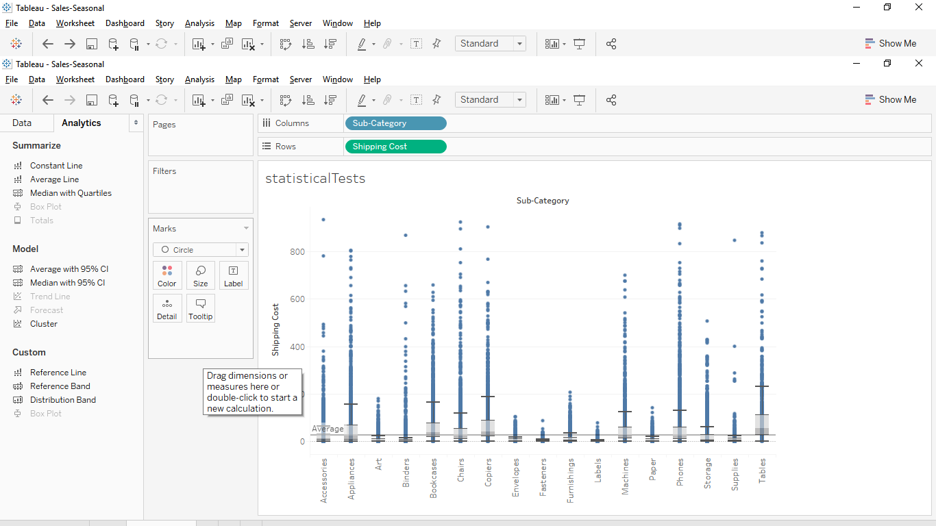 As I look at the above shipping costs, a question comes to mind: How do I form a hypothesis about whether shipping cost varies by sub-category or not?
All I can get from Tableau is perhaps a box plot to visually compare costs. Is that enough? Of course not.
What I would like to do is to find the average or mean shipping cost for each category or sub-category and then form a simple yes/no hypothesis.
Sadly, Tablau falls silent on this question. Maybe we can try different types of charts or compare data visually/manually across or down a table.
Typical Tableau users may find themselves constrained if they have to conduct such simple statistical comparisons, but there is a way out of this through Tableau’s scripting interface.
For this discussion, I am using the popular (and great) open source statistical computing environment, R.
If you are not familiar with R (R users can skip to the next section directly), here is the link to learn about, install, and get going with R: https://www.r-project.org/.
Install the R runtime environment depending on your OS: https://cran.r-project.org/bin/windows/base/
Install an Rserve package that will install and run the server component, which can listen for your requests to find a way out of this chasm between mere visualization and hard statistical testing.
Type library (Rserve)
Start RsServe by issuing the following command:
Rserve(debug = FALSE, args = NULL, quote=(length(args) > 1))
So, coming back to answering the question on multiple, simultaneous comparisons on average shipping cost between categories…
The test you can use is called the Tukey test. What you need now is:
A script in R that can run just fine on its own, and then…
Retool that script so it can be invoked from within the Tableau Script interface (which, considering its limitations on return types supported and the clumsy format adjustments, can take some time).
But here is a screenshot: 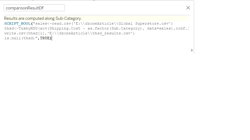
The approach I have taken is to simply define a boolean calculated variable that takes True or False, which is sufficient to indicate whether the R script for invoking the Tukey Test was successfully returned or not.
Now, given the poor support for data format conversions between R and Tableau, a safer and cleaner approach would be to have the script save the results as a delimited file (typically CSV) and then either import or paste the contents back into a Tableau environment.
This is what I have chosen to do, and the results look like this:
Now, we need an external environment to run the test, for, without the rigor of simultaneous, multiple comparisons that exhaust all potential combinations, we can not know the difference in mean cost for sure.
The key from now on is to have some way of recognizing the significant pairs visually, and that’s why these results are back in a Tableau environment. For this, we will use the magnitude of adjusted p-values.
This is where transformation functions become relevant. Taking a negative logarithm of p-values for each comparison is one approach in which smaller p-values get amplified and can be used to segment the differences into binary classifications.
From this point on, it is fairly straightforward. You can apply the transformed values to create a data visualization as shown below:
It should not be difficult now to weed out the insignificant sub-category pairs as far as the difference between average shipping costs is concerned.
Reference: I have used the Global superstore sales data which can be found here.