Table of Contents
The 7 R Packages You Should Be Using for Data Visualisation
With example code and free datasets
“It’s not what you do, it’s how you do it.” ― Cheri Huber, Suffering Is Optional: Three Keys to Freedom and Joy
Having data but not knowing how to visualise it is what I call self-inflicted suffering. So, like Cheri said, there are 3 keys to freedom and joy — my take on it — Data + R + these 7 R packages.
The Data
The 7 (Nonfatal) R Packages
Let’s start with the original library that makes R the best language for visualisation — ggplot2. I am making use of a dataset from Kaggle, which you can find here (Sustainable Development Solutions Network, 2019, License CC0: Public Domain). The data looks at the state of global happiness:

Code
An extension library to ggplot2 is called ggforce, which was developed by Thomas Pedersen. It has the added functionality of highlighting different groups and their specific features in your data, helping you to tell your story more effectively. You can see some ggforce examples here.
2. ColourPicker
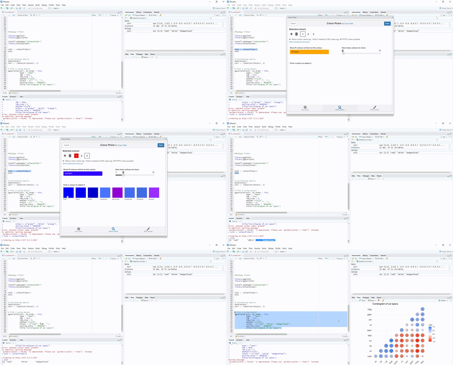
Don’t waste time googling the hex codes for the colours you want to use— Rather make use of ColourPicker! This is particularly useful if you are required to stick to a customized colour palette. See the demo below:

Here is the code I used in the demo:
If you would like to read more about creating custom palettes, see an article I wrote here.
3. Esquisse
Have the data but not sure how to visualise it? Or, not sure how to write the code in R? I present to you — Esquisse. The esquisse package is an open-source software created by Zeno Rocha in 2018. Here is the link to the GitHub repository.
For this demo, I am going to search for an open-source dataset by using Google dataset search — essentially a Google for datasets that are freely available:

It directed me to Kaggle, where I will be using data related to Marvel and DC Comic data (Govindaraghavan, S., , 2020, License CC0: Public Domain).
The following screen will appear:

Here you can import your data by uploading, pasting, connecting to a Google sheet or connecting to one of R’s built-in datasets. After I uploaded the marvel data, I see a preview pane before importing it:

Here is a short demo of how esquisse works:
PlotlyR is a free and open-source graphing library. You can view the GitHub repository here. The example I am going to use here is visualising the online customer journey as they move along your marketing funnel.

Immediately one sees that the issue lies on your website, since this is where the most customer churn is happening i.e., you are losing most of your customers before they even download the brochure. However, your brochure appears to be very informative, since you capture almost all the customers who did download it.
5. Quantmod
For anyone that likes analysing shares as a hobby or a job, Quantmod is for you. It is everything to do with financial modelling.

is if you need to plot anything in 3D.
Here are some examples the demo produced:
Lastly, what about bringing all your visualisations together? Patchwork was created by Thomas Lin Pedersen in 2017, to make this an easy exercise. You can download it from CRAN and here is the GitHub repository.
The output will look as follows:

Furthermore, here is a guide on how to patch your graphs together using various styles and annotations to neaten it up.
You are now fully equipped to explore interesting datasets. Each of these R packages have plenty of examples in their own documentation and repositories. I encourage you to pick a dataset that interests you and dive into these libraries. If you enjoyed this article, you may also want to read — .
This content was originally published here.