A well-designed product page can significantly impact customer engagement and conversion rates. Industrial product page designs play a pivotal role in showcasing products effectively, providing essential information, and ultimately driving sales. This article shows what constitutes effective designs, offers guidance on choosing templates, emphasizes the importance of design, and presents the top 15 high-quality industrial website examples.
Table of Contents
What Makes an Effective Industrial Product Page Design?
Several vital elements characterize an effective industrial product page design:
- Clarity: The design should communicate information clearly and concisely. Key product features, specifications, and benefits must be easy to find. Clear and concise information can increase user engagement by up to 30%.
- Visual Appeal: High-quality images and graphics can capture attention and enhance the page’s aesthetic. A visually appealing design can make products more enticing. 75% of people form their opinion of a website based on its design.
- User Experience (UX): Navigation should be intuitive, allowing users to find what they need without frustration. A seamless UX encourages visitors to stay longer and explore more.
- Responsiveness: Given the increasing use of mobile devices, product pages should be responsive, adapting to different screen sizes without compromising functionality or design.
- Call to Action (CTA): A strong CTA is crucial for guiding users toward the following steps, whether purchasing, signing up for a newsletter, or requesting more information.
- Trust Signals: Incorporating reviews, testimonials, and certifications can build trust with potential customers, increasing the likelihood of conversion.
- Load Speed: A fast-loading page improves user experience and can positively impact search engine rankings. Decreasing mobile site load times by just one-tenth of a second resulted in significant increases in conversion rates. Website speed statistics show that pages loading within 2 seconds have an average 9% bounce rate. For page load times of 5 and 6 seconds, the rates are 38% and 46%.
- SEO Optimization: Including relevant keywords in titles, descriptions, and alt tags enhances visibility in search engines.
A Guide to Choosing Industrial Product Page Design Templates
When selecting industrial website templates, consider the following factors:
- Industry Relevance: Choose templates that cater specifically to your industry. The template should reflect your needs in manufacturing, construction, or engineering.
- Customization Options: Look for templates that allow customization to align with your brand identity. The ability to modify colors, fonts, and layouts is essential for creating a unique presence.
- User Reviews and Ratings: Checking reviews and ratings can provide insight into the usability and functionality of the template.
- Support and Documentation: Good customer support and comprehensive documentation are crucial, especially if you encounter technical issues or have questions.
- Cost-Effectiveness: Assess the pricing structure of the template. Free templates may lack features, while premium options provide better support and functionalities.
The Importance of Design in Product Page Development
The design of an industrial product page is not merely aesthetic; it serves a functional purpose. A well-structured design can:
- Enhance Product Visibility: Strategic placement of images, descriptions, and CTAs ensures that critical information is highlighted, making it easier for customers to make informed decisions.
- Increase Conversion Rates: An intuitive and visually appealing design can increase conversion rates. A page that is easy to navigate encourages users to complete their purchases.
- Build Brand Identity: Consistent design elements reinforce brand identity and help establish a professional image. This is particularly important in the industrial sector, where trust and reliability are paramount.
- Facilitate Communication: Effective design facilitates communication between the business and the customer, providing necessary information and addressing potential queries proactively.
15 Best Examples of High-Quality Industrial Product Page Designs
Here are 15 exemplary industrial product page designs showcasing key features, pros, and cons:
1. John Deere
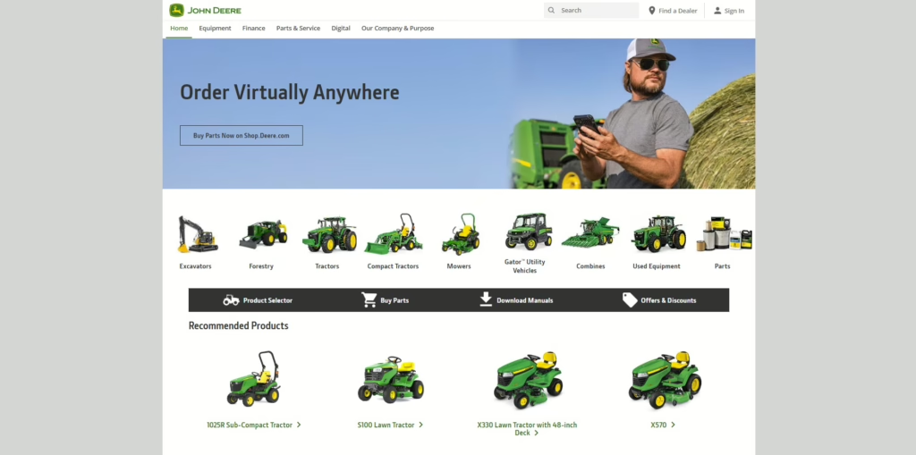
- Key Features: John Deere’s product pages offer interactive selectors, detailed descriptions, high-quality visuals, mobile-friendly design, and comparison tools for easy product filtering and side-by-side analysis.
- Pros: John Deere’s product pages are well-categorized, with products grouped by type and industry, making it easy for users to navigate and find what they need. Additionally, the site is fully mobile-optimized, ensuring that it works seamlessly on all devices, allowing for a smooth browsing experience whether on a smartphone, tablet, or desktop.
- Cons: The detailed, text-heavy content may slow down decision-making for some users.
2. Caterpillar
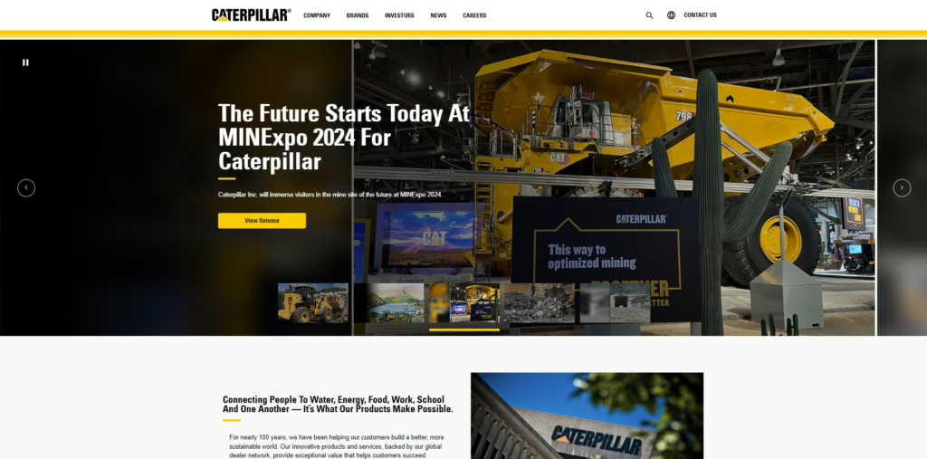
- Key Features: Caterpillar’s product page is renowned for its detailed product specifications, high-resolution images, and video demonstrations showcasing machinery in action. Each product page includes easy-to-navigate tabs for different sections, such as features, specifications, and accessories.
- Pros: The site excels in product visibility, allowing users to explore machinery from various angles. User-friendly navigation enhances the shopping experience, while robust support resources, including manuals and FAQs, provide additional value. According to a study by the Nielsen Norman Group, straightforward navigation can improve user satisfaction by 70%.
- Cons: However, some users may find the design cluttered due to the abundance of information on the page, which might overwhelm those looking for quick insights.
3. Honeywell

- Key Features: Honeywell employs clear call-to-action buttons (CTAs), product comparison tools, and extensive technical documentation that aids users in making informed decisions.
- Pros: The effective use of white space helps to guide users through the page without feeling overwhelmed. Its intuitive layout enhances usability and ensures users can easily find the necessary information.
- Cons: A downside is that there are limited customization options for users wanting to personalize their experience, which may limit the flexibility for specific customer segments.
4. Bosch

- Key Features: Bosch’s product pages feature easy navigation, a mobile-friendly design, and strong CTAs that direct users toward purchasing or learning more about products.
- Pros: The responsive design ensures a seamless device experience, with quick load times enhancing user satisfaction. The effective use of imagery showcases products in real-world applications.
- Cons: However, the site has limited product filtering options, which may hinder users from trying to narrow down their choices.
5. Parker Hannifin
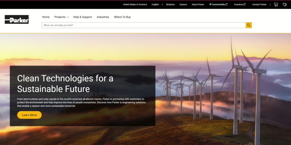
- Key Features: Parker Hannifin’s product pages cater to technical users, featuring detailed specs, interactive 3D models, downloadable CAD files, and robust filtering options for precise product searches.
- Pros: Advanced filtering and technical resources like 3D models and CAD files make it ideal for engineers. The pages are designed to provide everything needed for integration into technical projects.
Cons: The technical depth may overwhelm non-experts, and the layout could benefit from more user-friendly navigation for those seeking basic product information.
6. Siemens
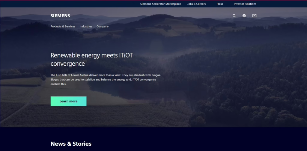
- Key Features: Siemens employs interactive product galleries, comparison tools, and extensive resources that allow users to explore products in-depth.
- Pros: The innovative design provides an engaging user experience, encouraging exploration. The strong brand recognition adds credibility to the products featured.
- Cons: Some features may require user registration, which could deter potential customers looking for immediate access to information.
7. Rockwell Automation
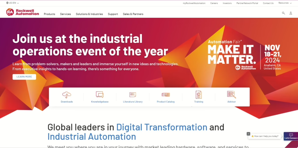
- Key Features: Rockwell’s pages showcase detailed product catalogs, case studies, and user testimonials highlighting product benefits and real-world applications.
- Pros: The effective use of multimedia, including videos and infographics, enhances user engagement. User-friendly navigation makes it easy for customers to find relevant information.
- Cons: New users may experience a learning curve with the design, as there are many options and information layers to navigate.
8. ABB
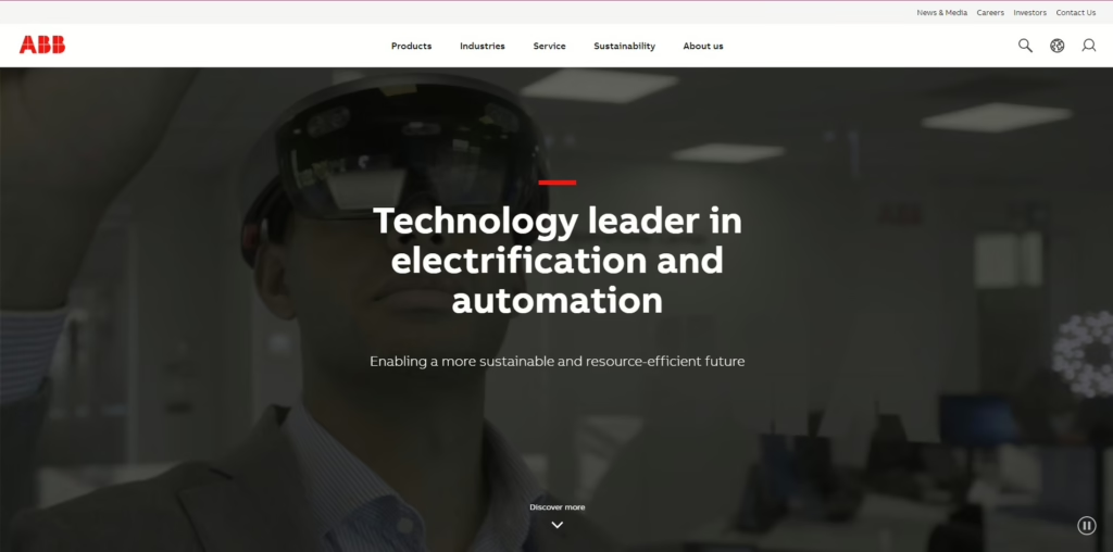
- Key Features: ABB’s product pages boast high-quality images, clear CTAs, and demonstrations that effectively highlight features and benefits.
- Pros: Attractive visuals and seamless user experience enhance engagement, while easy resource access supports informed purchasing decisions.
- Cons: The site may provide limited information on specific product categories, which could frustrate users seeking comprehensive details.
9. Honeywell Process Solutions
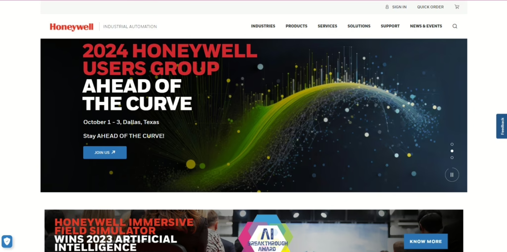
- Key Features: Honeywell Process Solutions offers detailed product descriptions, customer stories, and tailored industry solutions that resonate with specific market segments.
- Pros: The practical storytelling approach captures user interest while engaging visuals keep visitors on the page. Comprehensive information caters to a broad audience.
- Cons: The site may be slow to load due to heavy media content, potentially discouraging users with slower internet connections.
10. Emerson
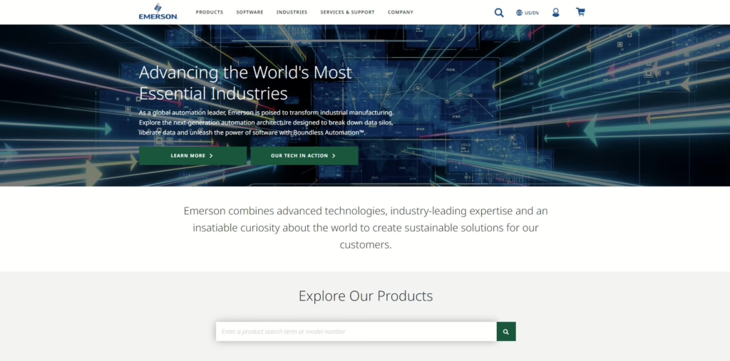
- Key Features: Emerson’s product pages feature robust filtering options, product comparisons, and application stories that guide users in selecting the right solutions.
- Pros: The intense focus on customer needs is evident, with clear organization and valuable insights provided throughout the pages.
- Cons: Navigation may be complex for some users, especially those unfamiliar with the product categories or industry terminology.
11. KUKA Robotics

- Key Features: KUKA’s pages include interactive product features, detailed case studies, and clear CTAs that prompt users to learn more or request quotes.
- Pros: The engaging multimedia elements and effective UX design create a compelling shopping experience. Detailed technical information is readily available for informed decision-making.
- Cons: Some users may find the layout busy, which could detract from the overall experience by making it difficult to focus on individual products.
12. Eaton
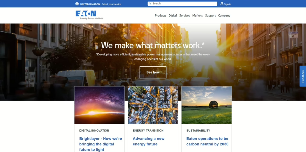
- Key Features: Eaton’s pages provide comprehensive product information, industry solutions, and robust customer support options to assist users throughout their journey.
- Pros: High-quality visuals and an organized layout enhance usability while effective CTAs guide users toward the next steps.
- Cons: However, limited customization options for branding may disappoint businesses looking for more personalization in their online presence.
13. Schneider Electric
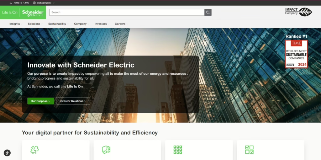
- Key Features: Schneider Electric’s product pages showcase detailed specifications, user-friendly navigation, and strong visuals that make information accessible.
- Pros: The responsive design ensures a smooth user experience, while quick access to information allows users to make decisions efficiently. Engaging storytelling keeps users interested.
- Cons: Some users may require additional support to navigate the site effectively, especially when searching for specific products or solutions.
14. Siemens Healthineers
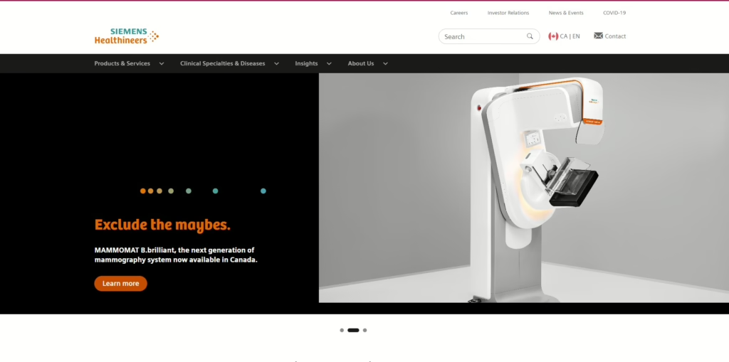
- Key Features: Siemens Healthineers utilizes clear CTAs, engaging visuals, and detailed product information highlighting key features and benefits.
- Pros: Effective multimedia keeps users engaged, while easy navigation ensures a positive user experience. The focus on customer needs is evident throughout the design.
- Cons: The limited product categories available may restrict options for users seeking a more comprehensive range of solutions.
15. Mitsubishi Electric
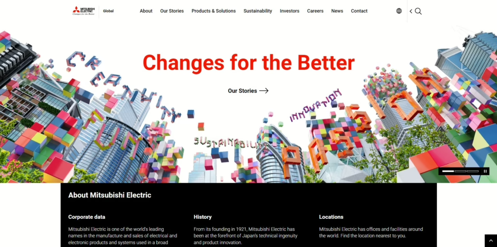
- Key Features: Mitsubishi Electric’s product pages include detailed product descriptions, customer testimonials, and technical resources that provide in-depth information.
- Pros: High-quality visuals and a clear information hierarchy make it easy for users to understand product offerings, while the user-friendly design enhances the overall experience.
- Cons: Some users may perceive the design as essential compared to more modern counterparts, which could impact their overall impression of the brand.
7 Best Practices for Creating High-Impact Designs
To ensure the success of your industrial product page designs, consider these best practices:
- Prioritize User Experience: Always design with the user in mind. Ensure that navigation is intuitive and that information is easy to find.
- Use High-Quality Images: Invest in professional photography to showcase your products effectively. Clear and engaging visuals enhance the overall design.
- Optimize for Mobile: With a significant portion of users accessing sites on mobile devices, ensure your designs are fully responsive.
- Incorporate Trust Signals: Include customer reviews, testimonials, and certifications to build trust with potential buyers.
- Keep Content Concise: Avoid overwhelming users with excessive information. Focus on key features and benefits that matter most.
- Test and Iterate: Regularly test your designs with real users to identify pain points and areas for improvement. Use analytics to understand user behavior.
- Stay Updated with Trends: Keep an eye on design trends within the industrial sector to ensure your pages remain modern and appealing.
10 Top Free Platforms for Designing Product Pages
If you’re looking for tools to develop industrial website design ideas, consider these free platforms:
- Wix: Offers user-friendly drag-and-drop features ideal for beginners.
- WordPress: Highly customizable with numerous themes and plugins.
- Canva: Excellent for creating visuals, although not specifically for web design.
- Weebly: An easy-to-use platform with templates tailored to industrial products.
- Shopify: While primarily for e-commerce, it offers robust design options.
- Squarespace: Known for its stunning templates, making it easy to create visually appealing pages.
- Webflow: A powerful design tool that allows for detailed customization.
- Figma: Ideal for collaborative design projects and prototyping.
- Adobe XD: Great for creating interactive prototypes and designs.
- Zyro: A simple website builder with drag-and-drop functionality.
Frequently Asked Questions
1. What are the key features of effective industrial product page designs?
Key features include clarity, visual appeal, user experience, responsiveness, call-to-action buttons, trust signals, load speed, and SEO optimization.
2. How can I choose a suitable template for my industrial product page?
When selecting a template, consider industry relevance, customization options, user reviews, support, and cost-effectiveness.
3. Why is design important in product page development?
Design impacts product visibility, conversion rates, brand identity, and communication effectiveness between businesses and customers.
4. Where can I find free platforms for designing product pages?
Popular platforms include Wix, WordPress, Canva, Weebly, Shopify, Squarespace, Webflow, Figma, Adobe XD, and Zyro.
Conclusion
In summary, industrial product page designs are vital for engaging customers and driving sales. Businesses can create effective pages that convert visitors into buyers by focusing on clarity, usability, and visual appeal. For those looking to enhance their online presence and tackle design challenges, Vinova offers expert web design services tailored to your needs. Get in touch today to start your journey toward an impactful online presence!