Gaming websites are no longer just portals; they are the beyond to immersive experiences. They captivate attention with stunning graphics, relevant images, and engaging videos, creating a world players can’t resist exploring. Your designs can transport users to new realms and keep them returning for more.
94% of first impressions are design-related, including gaming website designs. This underscores the crucial role of visually engaging websites in attracting attention and fostering higher emotional engagement, which in turn leads to improved conversion rates.
Starting a game development company, Vinova is here to offer you a list of 15 most captivating gaming website design examples that leave a lasting impression on your audience, emphasizing the significant impact of your work on the gaming industry.
Table of Contents
The Importance of Web Design for the Gaming Industry
A striking gaming website design is essential for attracting and retaining players. Your website’s design reflects your brand’s identity and values, influencing how visitors perceive your gaming platform.
According to a study, 46.1% of users admit to judging a website’s credibility based on its design. Good design highlights the importance of creating a visually appealing and user-friendly website.
A well-designed gaming website can:
- Attract more visitors: A visually appealing and informative website will draw in potential players.
- Keep users engaged: A user-friendly design encourages visitors to stay on your website and explore your content.
- Increase revenue: By providing a positive user experience, you can increase conversions and drive revenue.
5 Key Trends in Gaming Website Design for 2024
1. Interactive and Immersive Experiences
It’s 2024! Gaming websites are evolving beyond static pages. Interactive elements like 3D animations, parallax scrolling, and gamified interfaces create immersive experiences. Epic Games’ Fortnite is a gaming website design that showcases the power of these features in drawing players deeper into the gaming universe
2. Minimalistic and Clean Designs
Simplicity is critical to creating an effective gaming website design. Clean layouts, ample white space, and straightforward navigation allow users to focus on the content and easily find what they need. Gaming websites like Blizzard Entertainment and Ubisoft excel in this area, providing seamless user experiences that keep players engaged.
3. Personalization and Customization Options
Players want tailored experiences. Gaming websites will offer personalized recommendations based on user preferences, game history, and social interactions. Customizable profiles, themes, and avatars will also be popular. Steam does this exceptionally well, adapting its homepage to each user’s library and interests.
4. Bold Typography and Color Palettes:
Typography isn’t an afterthought anymore. Many gaming website designs use bold, game-inspired fonts to convey personality. Like PlayStation’s iconic blue and white, vibrant color schemes create brand recognition and evoke emotions.
5. Accessibility and Inclusivity Considerations
Designing for all players is essential. A good gaming website design will prioritize accessibility features, including alt text for images, keyboard navigation, and color contrast. Inclusivity extends to diverse representation in visuals and content. Xbox leads the way, emphasizing inclusivity through customizable controls and adaptive interfaces.
Top 15 Quality Gaming Website Designs of 2024
Coming up with awesome gaming website design ideas is a task! A striking gaming website doesn’t just appear out of nowhere. Here are the top 15 best gaming website design examples in 2024 for your design inspiration:
1. Firewatch:
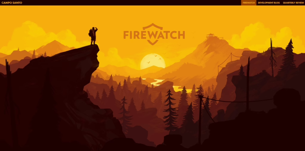
Firewatch stands out as a prime example of exceptional gaming website design. Its homepage immediately captivates attention with a stunning landscape perspective of the Wyoming wilderness, seamlessly shifting as users scroll. This immersive experience sets the tone for the entire website.
Key Winning Points:
- Clean and Minimalist Layout: The homepage’s uncluttered design focuses attention on the game, providing easy access to purchase options.
- Striking Color Scheme: The vibrant red color scheme complements the game’s aesthetic, creating a visually appealing and modern look.
- Engaging Visuals: Parallax scrolling and perspective shifts create a dynamic and immersive experience, drawing visitors into the game’s world.
- Strong Brand Identity: The website consistently maintains a cohesive brand identity, reflecting Firewatch’s unique style and tone.
- Clear Call to Action: Prominently displayed purchase options guide visitors toward taking the desired action.
2. God of War:
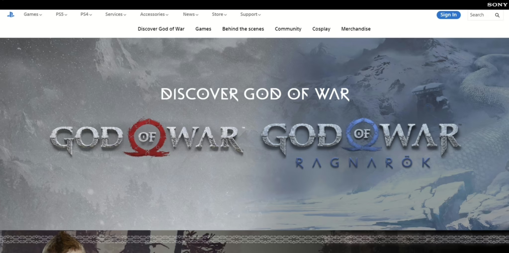
God of War, as featured on the Playstation website, is a professional gaming website design that showcases a stunning and immersive website that perfectly complements the game’s epic atmosphere. The design is characterized by its harmonious color schemes, striking imagery, and distinctive typography that immediately establishes the game’s identity.
Key Winning Points:
- Harmonious Color Schemes: The website’s color palette is carefully chosen to evoke the game’s Nordic, desolate theme. The use of muted tones and earthy hues creates a sense of realism and authenticity.
- Unique Typography: The typography used on the website is immediately recognizable to fans of the series, reinforcing the strong brand identity. The custom font choice adds a unique touch and enhances the overall aesthetic.
- Intuitive Navigation: The homepage features clear and easily identifiable call-to-action buttons, allowing players to navigate to the shop or other relevant sections with ease. The intuitive design ensures a smooth user experience.
- Stunning Imagery: The website is adorned with high-quality images that capture the essence of the game’s desolate Nordic wilderness. These visuals create a sense of awe and excitement, enticing visitors to explore further.
3. Planet Alpha:
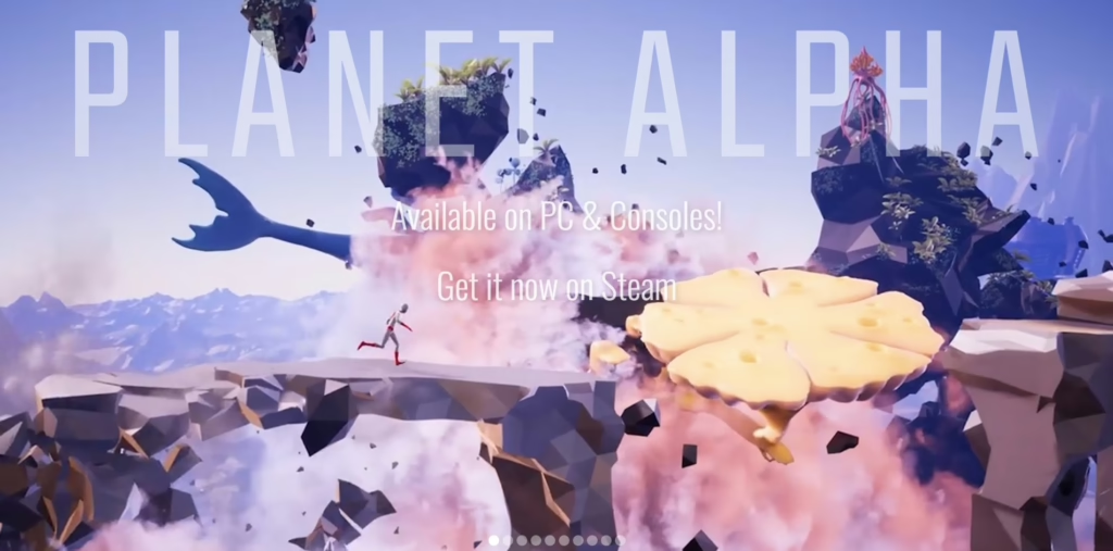
On their homepage, Planet Alpha showcases a visually stunning and engaging website that perfectly captures the game’s unique atmosphere. The homepage features a captivating animation banner that immediately immerses visitors in the game’s alien world, showcasing its exotic flora, fauna, and mysteries.
Key Winning Points:
- Immersive Animation Banner: The homepage’s animation banner immediately draws visitors in by offering a dynamic and visually striking preview of the game’s world. This unique and engaging approach effectively captures attention and sparks curiosity.
- Striking Alien World Design: The game’s alien world is visually distinct and memorable, featuring exotic flora, fauna, and unique landscapes that are unlike anything players have seen before. This uniqueness and visual appeal immediately captivate visitors and create a strong desire to explore.
- Creative Animations: The website features innovative and visually impressive animations that enhance the overall experience. These animations complement the game’s art style and storytelling, adding depth and interest to the website’s design.
4. Wayfinder:
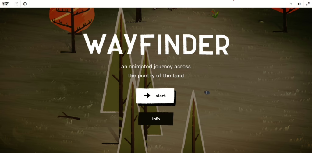
Wayfinder, a web game app, features a beautiful gaming website design that effectively teases the game’s captivating world and encourages exploration. The website’s stunning visual imagery, combined with the interactive minigame, creates a unique and engaging experience.
Key Winning Points:
- Beautiful and Tidy Web Design: The website’s overall design is visually appealing and well-organized, creating a pleasant and user-friendly experience.
- Stunning Visual Imagery: The use of high-quality images and animations effectively showcases the game’s beautiful landscapes and captivating atmosphere, enticing visitors to explore further.
- Interactive Minigame: The website’s interactive minigame turns the user’s pointer into a tool for exploration, allowing visitors to engage with the content in a fun and interactive way. This unique feature adds a layer of engagement and encourages visitors to spend more time on the website.
- Consistent Visual Style: The minigame’s design seamlessly integrates with the overall aesthetic of the website, maintaining a consistent visual style that reinforces the game’s brand identity. The serene landscape, with its scattered leaves and calming colors, reflects the peaceful and contemplative nature of the game’s world.
- Immersive Experience: The minigame’s interactive elements, such as the ability to manipulate the mini person, and the leaves and explore the environment, create a sense of immersion and engagement, inviting visitors to actively participate in the experience.
5. Apex Legends:
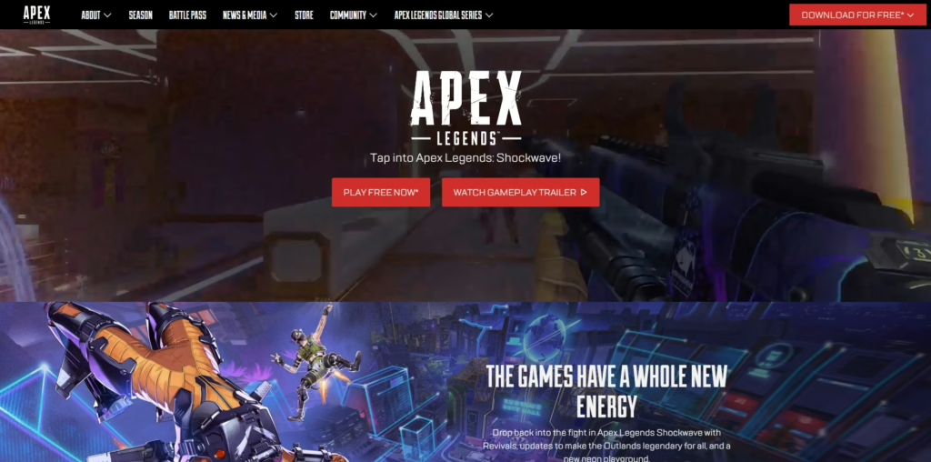
Utilizing one of the more popular gaming website design templates, Apex Legends is a gaming website design with a visually stunning and engaging website that effectively captures the game’s fast-paced and action-packed nature. The website’s high-quality design, combined with outstanding animations, creates a compelling and immersive experience.
Key Winning Points:
- High-Quality Website Design: The overall design of the website is visually impressive and well-organized, creating a professional and polished appearance.
- Outstanding Animations: The website features high-quality animations that showcase the game’s dynamic gameplay and unique characters. These animations are visually striking and effectively capture the excitement and intensity of the game.
- Action-Packed Animation Banner: The homepage’s animation banner features actual gameplay footage, providing visitors with a taste of the fast-paced action and intense battles that await them in Apex Legends.
- Clear Call to Action: The call-to-action button is prominently displayed on the banner in a bold red color, ensuring it stands out and attracts attention.
- Futuristic Neon Color Scheme: The website’s futuristic neon color scheme complements the game’s modern and technologically advanced setting, creating a visually striking and immersive atmosphere.
6. Borderlands:
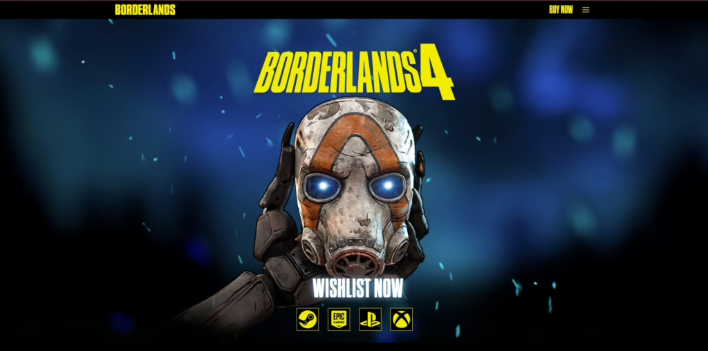
Visually striking and futuristic, Borderland is an example of a gaming website design that perfectly captures the game’s unique aesthetic, preparing for its next installment’s release. The website’s use of a black background with neon accents creates a visually impressive and modern look.
Key Winning Points:
- Futuristic Aesthetics: The website’s overall design reflects the game’s futuristic setting, creating a visually immersive and engaging experience.
- Visually Appealing Layout: The layout is well-organized and easy to navigate, with clear and concise information presented in a visually appealing manner. The use of consistent spacing, alignment, and typography contributes to a cohesive and professional look.
- Striking Color Scheme: The website employs a bold and contrasting color scheme, featuring a black background with neon yellow and blue accents. This creates a visually striking and modern look that is instantly recognizable and memorable.
- Recognizable Mascot: The website prominently features the game’s iconic generic psycho mask, reinforcing the brand identity and attracting attention.
7. The Last of Us:
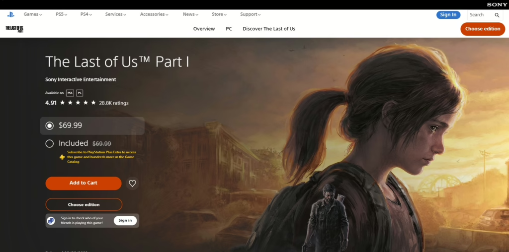
Another of Playstation’s hallmarks, The Last of Us’s homepage is a professional gaming website design, which showcases a visually stunning and immersive gaming website design that effectively captures the game’s post-apocalyptic atmosphere and compelling narrative. The website’s use of diverse images, striking color palettes, and effective use of white space create a visually appealing and engaging experience.
Key Winning Points:
- Diverse Images: The website features a variety of high-quality images that capture the game’s gritty and realistic setting, showcasing the characters, environments, and intense action.
- Striking Color Palette: The color palette is predominantly dark and subdued, reflecting the game’s somber and post-apocalyptic theme. The use of contrasting colors helps to highlight key elements and create visual interest.
- Effective Use of White Space: The website effectively uses white space to create a clean and uncluttered layout, allowing the images and text to stand out.
- Prominent Ellie Feature: The homepage prominently features Ellie, the game’s beloved protagonist, immediately drawing attention and connecting with fans.
- Strategic Placement of Cutscenes and Trailers: The placement of cutscenes and trailers at the bottom of the page is a strategic decision that allows visitors to explore the website’s content before being immersed in the game’s narrative.
8. The Legend of Zelda:
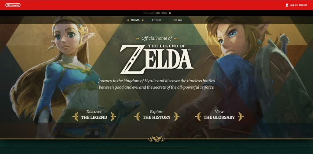
The Legend of Zelda utilizes a timeless and visually appealing website that perfectly captures the iconic franchise’s essence. The website’s use of recognizable elements, combined with a gentle color palette and interactive features, creates a memorable and engaging experience.
Key Winning Points:
- Recognizable Elements: The website prominently features the iconic Zelda logo, along with recognizable characters and familiar imagery from the game series. This immediate connection with fans helps to establish a sense of nostalgia and excitement, reinforcing the brand identity and attracting attention.
- Gentle Color Palette: The color palette is soft and calming, reminiscent of the lush landscapes and peaceful atmosphere often found in Zelda games. This creates a pleasant and inviting experience that is visually appealing and complements the game’s overall tone.
- Interactive Banner: The banner features an interactive element that ripples as the mouse cursor moves, adding a layer of engagement and encouraging exploration. The categories also glow when pointed at, providing clear visual feedback and guiding visitors toward the desired content.
- Unique Animation Style: The banner’s animation style is distinctive and visually appealing, showcasing a flock of leaves being blown away. This unique touch adds a touch of whimsy and charm to the website, setting it apart from other gaming websites.
- Consistent Visual Style: The website maintains a consistent visual style throughout, reinforcing the Zelda brand identity and creating a cohesive and visually appealing experience. The use of familiar elements, such as the Hyrule texture and art, further strengthens this connection.
- On-Point Navigation: Due to its extensive lore and world-building being a standout aspect of the game, the homepage highlights these sections, letting people navigate to these categories with ease!
9. Blizzard:
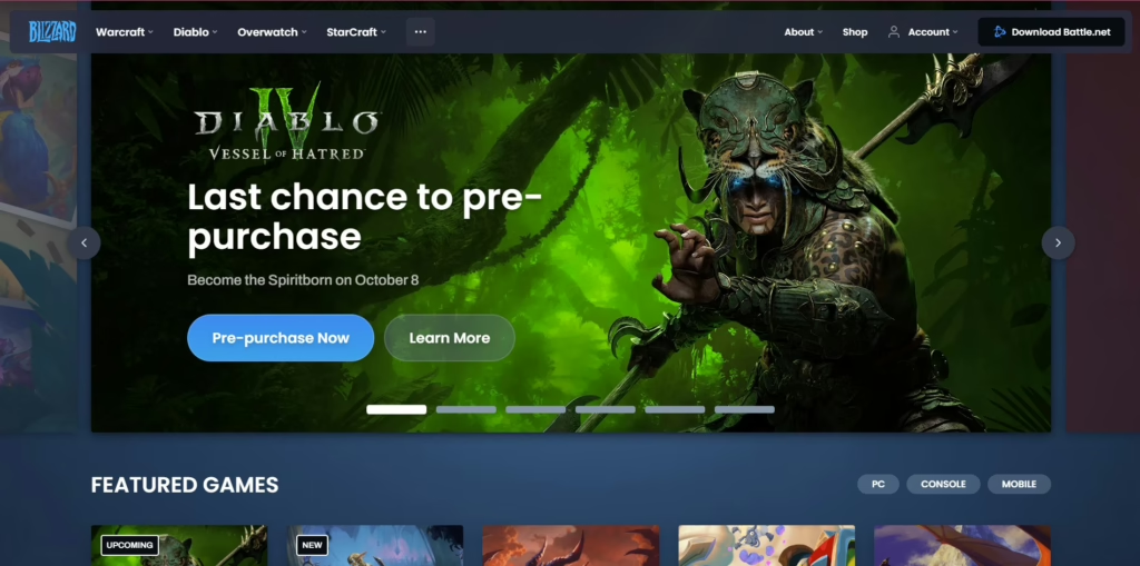
Blizzard’s gaming website design is a visually striking and well-organized website that effectively highlights its iconic gaming franchises. The website’s dark background with metallic blue accents creates a modern and professional look.
Key Winning Points:
- Iconic Gaming Franchises: The website prominently features Blizzard’s most popular games, such as World of Warcraft and Diablo, immediately capturing the attention of fans and attracting new players.
- Visually Appealing Design: The website’s dark background with metallic blue accents creates a visually striking and modern look that is both professional and visually appealing.
- Slider Gallery: The slider gallery on the homepage effectively showcases Blizzard’s most popular games, allowing visitors to quickly browse through the available options and find the game that interests them.
- Clear Navigation: The game titles are clearly displayed below the slider gallery, making it easy for visitors to navigate to their desired game and explore its content.
- Focus on Popular IPs: By highlighting its most popular franchises, Blizzard effectively leverages its brand recognition and attracts a wider audience.
10. Across The Multiverse
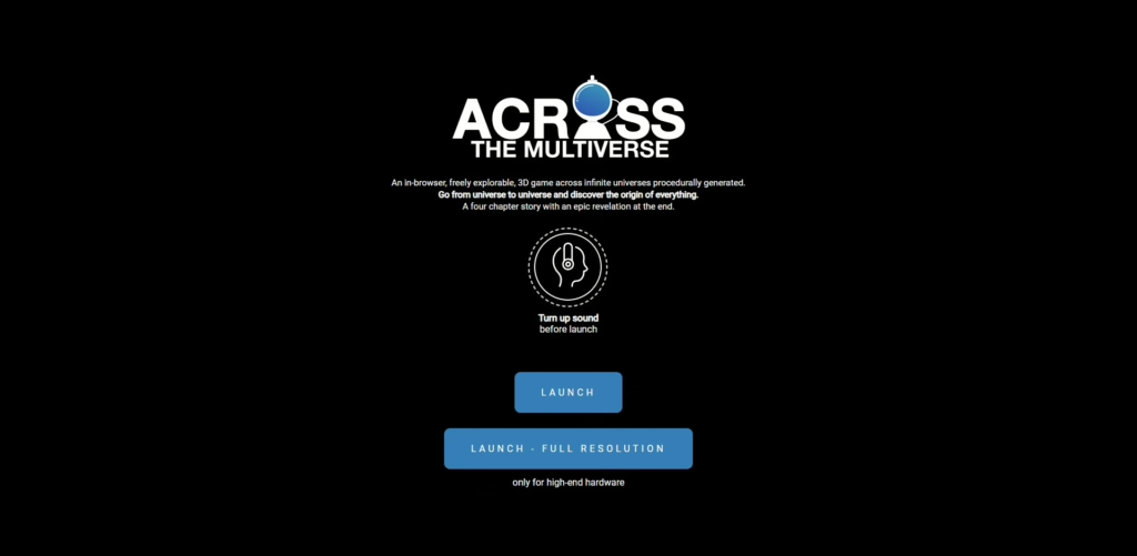
Across the Multiverse’s gaming website design effectively captures the game’s unique atmosphere. The website’s dark background with white and blue accents creates a minimalist space theme that complements the game’s setting.
Key Winning Points:
- Minimalist Space Theme: The website’s design reflects the game’s futuristic and otherworldly setting, creating a visually appealing and immersive experience.
- Clear and Intuitive Interface: The use of clear and easy-to-follow buttons, combined with clear instructions, makes the website easy to navigate and use.
- Visually Stunning Graphics: The game’s graphics are visually impressive, creating a captivating and engaging experience for players.
11. Chess
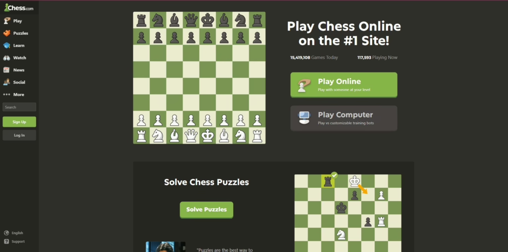
Chess.com’s gaming website design stands out because of its simplicity and user-friendliness. While the game of chess itself is complex, Chess.com’s website prioritizes a clear and intuitive design that caters to players of all levels.
Key Winning Points:
- Effortless Navigation: The website’s user interface (UI) is straightforward to navigate. Information is readily accessible on the landing page, ensuring visitors can understand the site’s purpose and functionality within seconds.
- Minimalist Design with Character: The website’s 2D graphics and clip art showcase a minimalist approach that evokes nostalgia and uniqueness. This stands out in a design landscape often dominated by complex visuals. This simplicity also contributes to the site’s longevity, fostering a sense of loyalty among players who have enjoyed its consistent and classic aesthetic for years.
- Focus on Play: The homepage prominently features an illustration of a chessboard, immediately conveying the purpose of the website. Alongside it are large, clear buttons for selecting playing modes, encouraging visitors to jump right into the action.
- Globally Recognized: With a massive global membership exceeding 100 million, Chess.com has established itself as the top choice for online chess play. This success highlights the effectiveness of the website’s design in catering to a wide audience of chess enthusiasts.
12. Rockstar Games
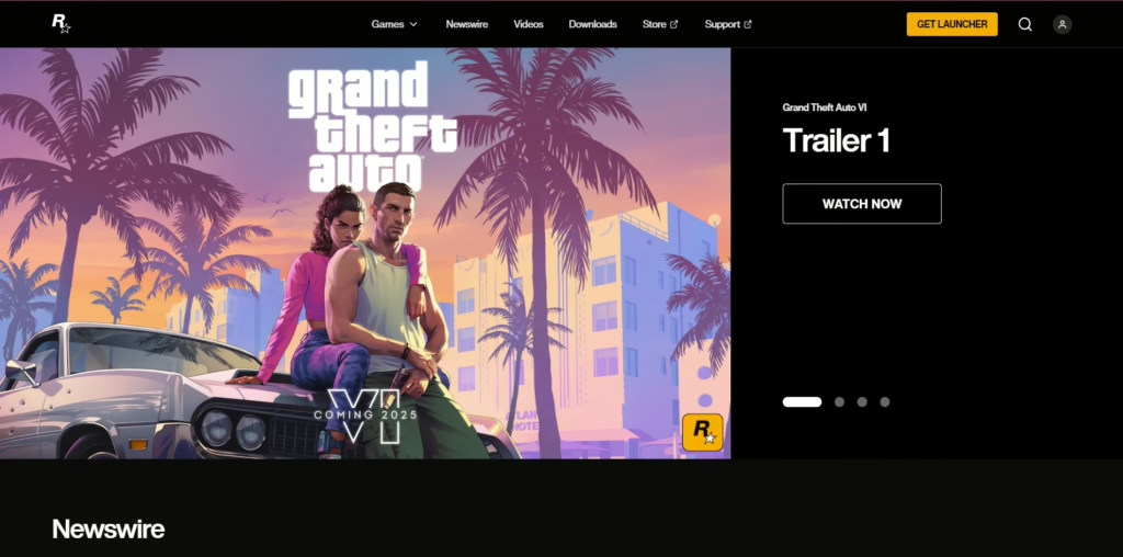
Rockstar Games showcases a well-organized website that effectively highlights its iconic gaming franchises. The website’s dark background with metallic blue accents creates a modern and professional look. This design is so popular, it is often seen in free gaming website design templates:
Key Winning Points:
- Iconic Gaming Franchises: The website prominently features Rockstar’s most popular games, such as Grand Theft Auto and Red Dead Redemption, immediately capturing the attention of fans and attracting new players.
- Visually Appealing Design: The website’s dark background with metallic blue accents creates a visually striking and modern look that is both professional and visually appealing.
- Slider Gallery: The slider gallery on the homepage effectively showcases Rockstar’s most popular games, allowing visitors to quickly browse through the available options and find the game that interests them.
- Clear Navigation: The game titles are clearly displayed below the slider gallery, making it easy for visitors to navigate to their desired game and explore its content.
- Focus on Popular IPs: By highlighting its most popular franchises, Rockstar effectively leverages its brand recognition and attracts a wider audience.
13. Electronic Arts
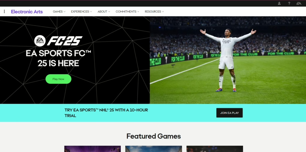
Electronic Arts showcases a visually appealing and well-organized website that effectively highlights its diverse portfolio of games. The website’s bright white background and clear navigation create a user-friendly experience that is consistent with the style of many EA games.
Key Winning Points:
- User-Friendly Design: The website’s clean and uncluttered layout, combined with clear navigation, makes it easy for visitors to find the information they need.
- Visually Appealing Animations and Videos: The website features a rich array of animations and videos that showcase the games dynamically and engagingly.
- Effective Segmentation: The content is well-organized and segmented, with the most essential information prominently displayed at the top of the page. This ensures that visitors can easily access the content they are most interested in.
- Iconic Game Buttons: The buttons used for navigation feature recognizable images of popular EA games, attracting attention and guiding visitors to the relevant content.
14. Steam
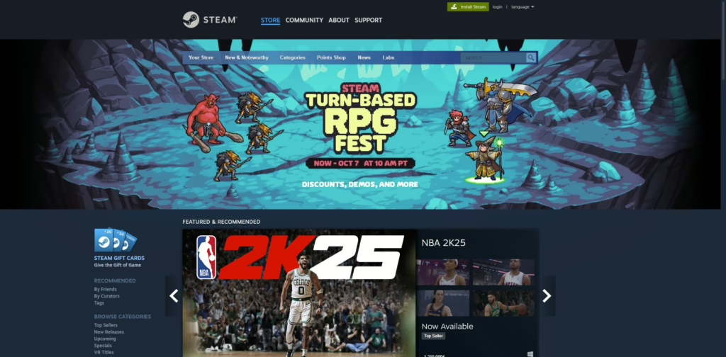
As one of the most recognizable gaming website design examples, Steam showcases a visually appealing and user-friendly website that effectively highlights its vast library of games. The website’s iconic color scheme and recognizable design elements contribute to a strong brand identity.
Key Winning Points:
- Iconic Color Scheme: The use of Steam’s signature blue color throughout the website creates a consistent and recognizable visual identity.
- Interactive Design: The website features interactive elements, such as the categories lighting up when the mouse cursor moves over them, enhancing the user experience and encouraging exploration.
- Slider Gallery: The slider gallery on the homepage effectively showcases the platform’s most popular games, attracting attention and encouraging users to discover new titles.
- User-Centric Design: The website is designed with the user experience in mind, featuring clear navigation, well-organized categories, and a focus on special offers. This approach caters to the needs of gamers and makes it easy to find the desired content.
15. Halo: Waypoint
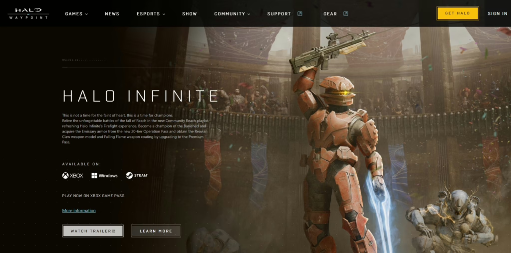
Halo: Waypoint is a visually stunning and engaging gaming website design that perfectly captures the essence of the Halo franchise. Its design, menu, and fonts seamlessly blend the creativity and style of the Halo games, creating an immersive online experience.
Key Winning Points:
- Halo-Inspired Design: The website’s design elements, such as the slider and video players, are distinctly Halo-themed, creating a familiar and immersive atmosphere for fans.
- Unique Fonts: The use of unique fonts that complement the Halo aesthetic adds to the overall visual appeal and reinforces the brand identity.
- Interactive Features: Waypoint offers a range of interactive features, including leaderboards, game stats, forums, and blogs, allowing fans to connect and stay up-to-date on the latest Halo news.
- Iconic Banner: The main banner prominently features a recognizable Halo character, immediately capturing the attention of fans and reinforcing the brand identity.
Frequently Asked Questions:
How do I create my own game website?
After having decided on your gaming website design templates, by following these steps, you can create a successful gaming website.
1. Plan: Define your niche, goals, and target audience.
2. Choose: Select a domain name, web host, and website builder.
3. Customize: Create a custom design and pages.
4. Build Community: Start a blog and forum.
5. Monetize (Optional): Explore advertising, affiliate marketing, or selling products.
6. Optimize: Improve your website’s SEO.
7. Host Server (Optional): If hosting multiplayer games, set up a server.
What to include in a gaming website?
To create a successful gaming website, focus on these key elements:
- Visually appealing design: Make it look great.
- Easy to navigate: Keep it simple for visitors.
- High-quality visuals: Use clear images and videos.
- Showcase games: Highlight your products with descriptions.
- Social features: Include ways for people to interact.
- Mobile-friendly: Ensure it works well on smartphones.
What are the different types of game websites?
Whether you are using premium or free gaming website design templates, there are three main types of video game websites:
- Stand-Alone Game Websites: These websites are dedicated to a single game or franchise, providing in-depth information, news, and community features.
- Landing Pages: These are simple websites that promote a specific game or product, often with a focus on driving sales or downloads.
- Game Reviews/Info Portals: These websites offer reviews, news, and information on a wide range of games, serving as a resource for gamers to discover new titles and learn about the latest industry trends.