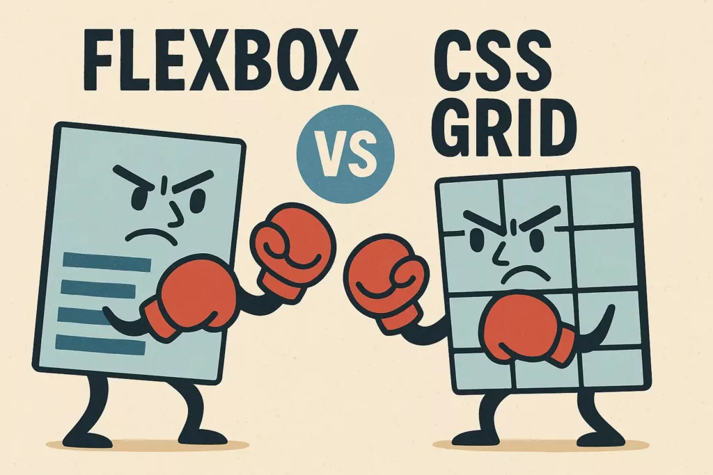
Building modern, responsive web layouts used to be a major challenge. Today, two powerful CSS tools make it much easier: Flexbox and Grid.
In 2025, knowing just one isn’t enough. Over 95% of professional web developers now report using both regularly. The key isn’t to ask which is “better,” but which is the right tool for the job.
This guide will break down the key differences between them. We’ll show you what each tool is best for, helping you choose the right one for any layout challenge you face.
Table of Contents
The Core Distinction: One-Dimensional vs. Two-Dimensional Layout
TIn 2025, over 60% of all web traffic comes from mobile devices. Building layouts that look great on any screen is essential. CSS Flexbox and Grid are the two main tools for the job, but they are designed for different tasks.
The most important difference is simple: one dimension versus two.
CSS Flexbox: The One-Dimensional Tool
Flexbox is perfect for arranging items along a single axis. Like items on a shelf, you can line them up, space them out, and decide how they align on that one shelf—either in a row or a column.
It’s the right tool for components like navigation bars, aligning items inside a card, or centering a single element on a page. Even if items wrap to a new line, each line acts as its own independent shelf.
CSS Grid: The Two-Dimensional Tool
Grid gives you control over both rows and columns at the same time, creating a strict structure.
Grid is perfect for laying out the entire page or complex components that need precise alignment. When you place an item in a grid cell, it stays aligned with everything else in that same row and column. This gives you powerful control in two dimensions.
Why This Matters in 2025
With over 4.3 billion active mobile internet users, layouts must work well on small screens. At the same time, desktop traffic, around 37% of the total, shows deeper engagement. Desktop users visit more pages and stay longer. Therefore, layouts also need to support detailed content on larger screens.
Technologies like 5G and progressive web apps (PWAs) make users expect faster, app-like experiences. This increases the need for high-performing, flexible layouts. The standard practice in 2025 is to combine Flexbox and Grid. Use Grid for the overall page structure and Flexbox for the smaller components within it.
Layout Philosophy: Content-Out vs. Layout-In
In 2025, a consistent user experience is a top priority. The focus on layout has clear business reasons. Poor design can have significant consequences. For instance, 32% of customers will abandon a brand after just one bad experience. On mobile, 74% of visitors are more likely to return to a website if it offers a good user experience.
The different design philosophies of Flexbox and Grid help you achieve this in different ways.
Flexbox: The “Content-First” Approach
In 2025, over 62% of web traffic comes from mobile devices. Flexbox’s ability to adjust to screen width is essential for mobile-first design. Its simpler, one-dimensional control also allows for faster development of small UI elements.
Flexbox works from the content-out. Think of it like packing a duffel bag. You have a bunch of items (your content), and you let them arrange themselves inside the bag based on their own size. The layout is flexible and adapts to the content.
This makes Flexbox perfect for components where you don’t know the exact size of the content, like a row of buttons that might have different text labels.
Grid: The “Layout-First” Approach
Grid works from the layout-in. Think of it like a bento box with predefined compartments. You first design the structure (the rows and columns), and then you place your content into those specific slots. The layout dictates where the content goes.
This makes Grid the ideal tool for the overall page structure, where you want a deliberate, predictable, and organized layout that doesn’t change based on the content inside it.
Alignment and Sizing
Good design builds trust. In 2025, studies show that over 75% of users judge a company’s credibility based on its website design, and clean alignment is a key part of that.
Both Flexbox and Grid give you powerful control over alignment, but they think about it in different ways.
Flexbox: Aligning the Group
Flexbox is great at aligning a group of items along a single line. Think back to the books on a shelf. Flexbox lets you decide how to distribute those books. You can:
- Push them all to one side.
- Center them in the middle.
- Spread them out with even spacing between them.
You are controlling the alignment of the items relative to each other. This makes Flexbox effective for navigation menus, button groups, and toolbars. With mobile users making up nearly 63% of global web traffic, Flexbox’s ability to dynamically align and space items is vital for responsive design. Its fluid alignment also helps reduce layout shifts, which improves Core Web Vitals scores and is an important SEO factor in 2025.
Grid: Placing Items in a Box
Grid gives you more precise control over placement. Think of the bento box with its compartments. Grid lets you decide exactly where an item sits inside its own compartment.
You can pin an item to any corner of its grid cell, center it perfectly, or stretch it to fill the entire space. You have total control over an item’s position within its predefined area.
This precision is necessary for complex layouts such as dashboards, product galleries, or magazine-style pages. Grid’s control over both rows and columns maintains visual harmony across different screen sizes. With over 79% of top digital products using design systems in 2025, Grid’s structured alignment supports reusable and predictable layout patterns that build user trust.
Why Precise Alignment Matters
The connection between clean design and credibility makes alignment a business priority, not just an aesthetic choice. Pages with poor visual structure can lose up to 40% of their visitors within the first 10 seconds.
Consistent alignment also improves readability and accessibility. This is essential, as over 15% of the world’s population experiences some form of disability. Using Flexbox and Grid correctly can improve Cumulative Layout Shift (CLS) metrics, a key factor in Google’s Core Web Vitals that affects search rankings.
When to Use Flexbox vs. When to Use Grid
Using the right tool for the job matters. In 2025, developers report that fighting with the wrong CSS layout tool can add up to 15% more time to a project’s development cycle. Knowing when to use Flexbox versus Grid saves you time and frustration.
Here is a simple guide.
When to Use Flexbox
Flexbox is your go-to tool for arranging items in a single direction. Think of it as organizing the smaller components on your page.
Use Flexbox for:
- Small UI Components: It is perfect for navigation bars, button groups, and aligning items inside a card.
- Lining Things Up: When you need to arrange items in a single row or column and easily control their spacing.
- When Content is King: If your layout needs to be flexible and adapt to the size of the content inside it.
When to Use CSS Grid
Grid is the master of the overall page layout. Use it when you need to control both rows and columns at the same time.
Use Grid for:
- Overall Page Layout: It is the best tool for creating the main structure of your site, like the header, sidebar, and footer.
- Complex, Two-Dimensional Designs: Any layout that needs items to be perfectly aligned in both rows and columns is a job for Grid.
- When Layout is King: If you need a strict, predictable structure that your content must fit into.
A Helpful Rule of Thumb
If you find yourself “fighting” Flexbox to make items line up with the row above or below, stop. You are probably trying to create a two-dimensional layout. You should be using CSS Grid instead.
Responsive Design: A Practical Comparison
A non-responsive website is a leaky bucket for customers. In 2025, over 70% of users will leave a site that provides a poor mobile experience. Both Flexbox and Grid are essential tools for creating responsive designs that keep users engaged, but they solve problems in different ways.
A Real-World Example: A Gallery of Cards
A perfect way to see the difference is with a common design pattern: a gallery of product cards.
The Flexbox Approach (and its problem)
You can use Flexbox to create a gallery where cards automatically wrap to a new line on smaller screens. This works well, but it often creates the “last row problem.” If the final row has fewer items than the rows above it, Flexbox will stretch those last few cards to fill the entire width. This creates an inconsistent and unprofessional look.
The Grid Solution
Grid solves this problem perfectly. Because Grid creates a strict column structure, the cards in the last row simply stay in their own cells. They don’t stretch to fill the empty space. This keeps the entire gallery looking clean, aligned, and professional on any screen size.
Practical Tips for 2025 Responsive Design
- Use CSS Grid with repeat(auto-fit, minmax(250px, 1fr)) to create flexible galleries that adapt seamlessly to screen width.
- Employ Flexbox inside each card to align images, text, and buttons efficiently, ensuring consistent spacing and alignment.
- Combine media queries targeting content needs (using min-width breakpoints) rather than device-specific sizes to future-proof your design.
- Implement lazy loading and responsive images (e.g., WebP format with srcset) to improve load times and performance on mobile devices.
Synergy: Using Flexbox and Grid Together
In 2025, developers spend nearly 40% of their time maintaining existing code. Writing clean, logical CSS is a major factor in long-term efficiency. The most effective way to build modern layouts isn’t to choose between Flexbox and Grid, but to use them together.
The Best of Both Worlds: Grid + Flexbox
Just like building a house, you use one set of tools for the big structure and another for the small details inside. A modern best practice is to separate your layout into two levels:
- Grid for the “Macro” Layout: Use Grid to create the main structure of your page. Think of this as the overall “scaffolding”—your header, footer, sidebar, and main content area.
- Flexbox for the “Micro” Layout: Use Flexbox to arrange the items inside each of those larger grid areas. For example, after creating your header with Grid, use Flexbox to perfectly align the logo and navigation links within it.
This hybrid approach makes your code cleaner, easier to understand, and much simpler to maintain over time.
Conclusion
In the 2025 job market, “knowing CSS” isn’t enough. Over 98% of front-end developer job postings now list both Flexbox and Grid as essential skills. The debate isn’t about which tool is better; it’s about knowing how to use both effectively.
The best practice is simple: use them together.
- Use Grid to create the large-scale structure of your page, like a building’s foundation and frame.
- Use Flexbox to arrange the smaller items inside each room, like the furniture.
This hybrid approach leads to cleaner, more powerful, and easier-to-maintain code.
Final Cheat Sheet: Flexbox vs. Grid
| Feature | Flexbox | Grid |
| Layout Direction | One Direction (Row OR Column) | Two Directions (Rows AND Columns) |
| How it Thinks | Content-First (Adapts to content) | Layout-First (Content fits the layout) |
| Best For | Small components (navbars, cards) | Overall page structure |
Ready to build modern, responsive layouts for your next project? Our team can help with all your IT needs. Contact us today.