Do you know: A good user experience (UX) design can boost conversion rates by up to 400%?
Navigating a website should be easy and breezy, for the sake of your users! A well-organized navigation system not only enhances user experience but also improves your website’s SEO and conversion rates.
In this blog, we’ll explore 9 web navigation examples, their web navigation design highlights and share best practices that can make your website user-friendly. From the minimalist elegance of Apple’s design to the comprehensive menus of Amazon, discover how these 9 best design navigation bar examples from industry leaders guide users effortlessly to their desired destinations.
Table of Contents
What Is Website Navigation?
Website navigation is a friendly signpost that helps people find their way around your site. A well-designed navigation system not only makes it easy for users to find what they’re looking for in their menu in website design but also improves your website’s overall user experience and search engine rankings.
Key Components of Website Navigation:
- Navigation Bars: The main menu at the top or side of your website, linking to key sections.
- Menus: In terms of web navigation design, lists of options or links that users can click on.
- Links: Clickable elements that take users to other pages within or outside your website.
- Buttons: Interactive elements that trigger actions like submitting forms or navigating to other pages.
Why Is Website Navigation Important?
More than just a convenience, a well-structured navigation system is a crucial element of a successful website:
- User Guidance: Helps users find what they need quickly, reducing frustration and improving the overall experience.
- SEO Boost: Makes your website easier for search engines to crawl and index, potentially improving your search rankings.
- Conversions: A clear navigation system can lead to higher engagement and conversions as users can easily find what they’re looking for and take action.
- Content Organization: Helps users understand the structure of your website and locate information effortlessly.
9 Effective Website Navigation Examples
Let’s take a look at how some of the world’s 9 most popular websites and their menu in website designs, which have mastered the art of web navigation. While you can download navigation bar HTML CSS templates for free online, by analyzing these web navigation examples, gain valuable insights and inspiration for improving your own navigation systems.
Amazon

Type of Navigation Menu: Mega Menu with Sidebar
Amazon’s navigation shows you how to effectively handle a vast product catalog. Their mega menu, combined with a well-organized sidebar, allows users to effortlessly drill down into specific categories. This layered approach provides a clear and efficient way to browse their extensive product offerings.
User Benefits:
- Efficient Product Discovery: Amazon’s navigation helps users quickly find what they’re looking for, even within their vast product catalog.
- Intuitive Design: The design is visually appealing and user-friendly, with clear hover effects that provide instant feedback.
Apple
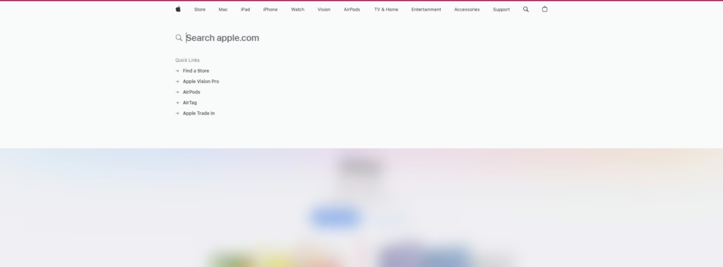
Type of Navigation Menu: Minimalist Top Navigation
Among these navigation bar examples, Apple’s navigation is a prime example of how less can be more. Their minimalist design reflects their brand’s ethos of simplicity and elegance. The straightforward top navigation bar allows users to focus on key products without being overwhelmed. This uncluttered approach reduces cognitive load, making it easier for users to find what they need.
User Benefits:
- Clarity and Focus: Apple’s minimalist navigation allows users to focus on key products without distractions.
- Reduced Cognitive Load: The simple design makes it easier for users to find what they need.
BBC
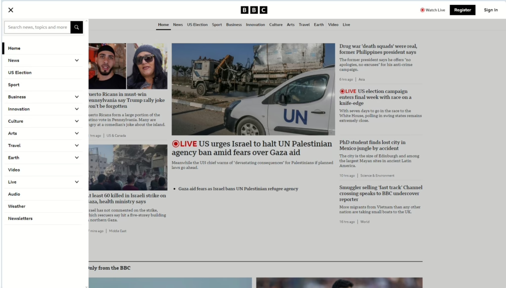
Type of Navigation Menu: Mega Menu
Among the discussed web navigation examples, the BBC’s mega menu is a testament to the power of effective navigation in organizing a vast amount of content. By dividing their content into easily navigable sections, the BBC caters to diverse user interests and prevents users from feeling overwhelmed.
User Benefits:
- Clear Organization: The mega menu structure helps users find what they’re looking for quickly and easily.
- Diverse Content: The BBC’s wide range of topics ensures there’s something for everyone.
Airbnb
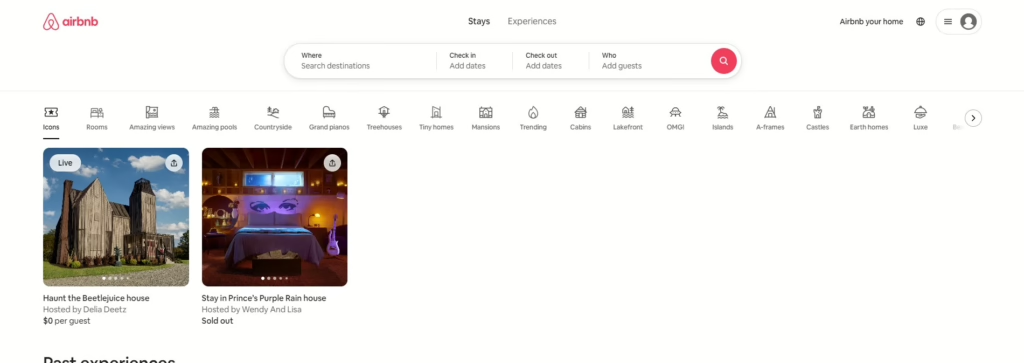
Type: A search container and an icon menu
The effectiveness of Airbnb’s sticky navigation relies heavily on a robust and responsive search functionality. By keeping essential links visible as users scroll, Airbnb makes it easy for users to quickly access key features like searching for listings or managing bookings.
User Benefits:
- Accessibility: Sticky navigation ensures important links are always within reach, especially for mobile users.
- Efficiency: Users can easily switch between different sections of the website without having to scroll back to the top.
Spotify
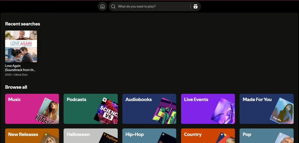
Type of Navigation Menu: Sidebar Navigation
Spotify’s sidebar navigation is a key feature that allows users to efficiently manage their extensive music libraries. The vertical layout makes it easy to switch between playlists, podcasts, and other content, providing a seamless user experience. This design highlight is a great example in optimizing for user-friendly navigation.
User Benefits:
- Efficient Library Management: The sidebar allows users to quickly navigate through their playlists and podcasts.
- Seamless Switching: Users can easily switch between different types of content without getting lost.
Dropbox
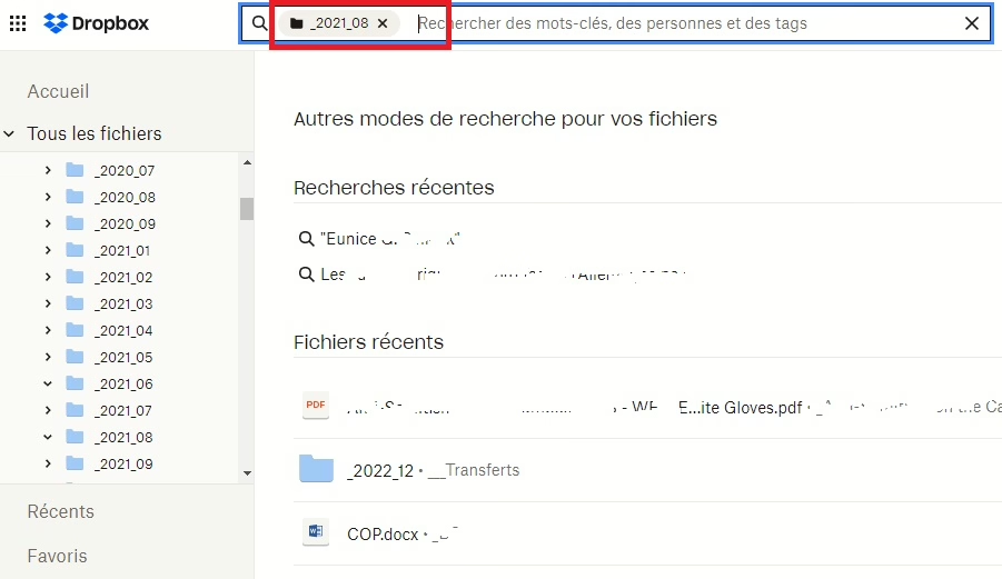
Type of Navigation Menu: Clean Horizontal Navigation
As the only online file hosting site among these web navigation examples, Dropbox’s clean horizontal navigation showcases its focus on functionality over aesthetics. By keeping the design simple and uncluttered, Dropbox allows users to concentrate on their primary task: managing files.
User Benefits:
- Clarity and Focus: The minimalist design eliminates distractions and helps users stay focused on their tasks.
- Efficiency: The straightforward navigation makes it easy for users to find and access their files.
Medium
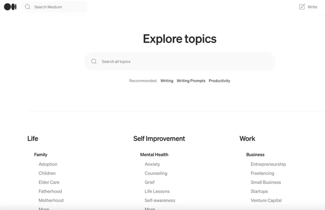
Type of Navigation Menu: Sticky Navigation Bar
Medium’s sticky navigation bar proves how sticky navigation bar designs can enhance user experience. By keeping key links visible while users read articles, Medium encourages exploration and makes it easy for users to navigate between different pieces of content. The navigation bar also doesn’t obstruct the reading experience.
User Benefits:
- Accessibility: Sticky navigation ensures important links are always within reach, making it easy for users to navigate between articles.
- Encourages Exploration: By keeping related content visible, sticky navigation encourages users to discover more articles and stay engaged.
Slack
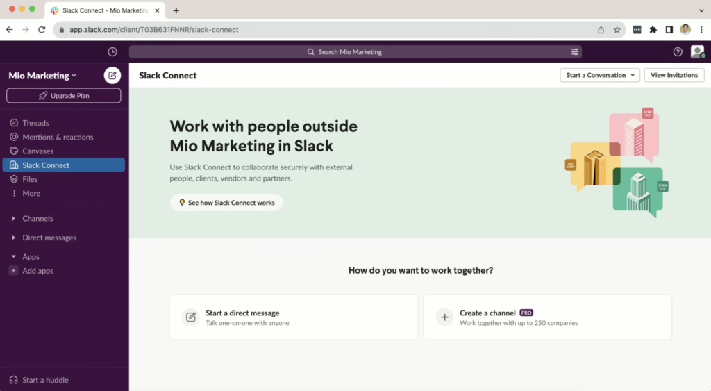
Type of Navigation Menu: User-Friendly Interface with Tabs
Slack’s user-friendly interface, featuring tabs for channels and direct messages, is a key factor in its success as a team communication platform and makes it one of the web navigation examples we have chosen. This well-organized and intuitive navigation allows users to easily switch between different conversations and access essential tools.
User Benefits:
- Efficient Collaboration: The tab-based navigation enables seamless switching between channels and direct messages, streamlining communication.
- Intuitive Interface: Slack’s design is user-friendly, making it easy for users to navigate and find the information they need.
Nike
Type of Navigation Menu: Dynamic Drop-down Menu
Nike’s dynamic navigation menu is a standout feature that adapts based on user interactions. Their approach combines a horizontal navigation bar with dropdown menus and a mega menu to provide a clear and efficient way for users to explore their vast product catalog compared to others in our web navigation examples.
User Benefits:
- Intuitive Navigation: The horizontal navigation bar makes it easy for users to quickly locate key categories.
- Product Discovery: Dropdown menus provide a clear overview of subcategories, helping users find specific items efficiently.
- Enhanced Discoverability: The mega menu allows users to see a wider range of products at once, making it easier to find what they need.
5 Best Practices for Website Navigation Menus
Effective website navigation is crucial for enhancing user experience, improving search rankings, and increasing conversion rates. Here are five best practices for designing user-friendly navigation menus that can significantly impact your website’s performance that you can learn from the mentioned web navigation examples.
- Descriptive Navigation Labels: Use clear and specific labels that accurately reflect the content behind each link. This helps users quickly find what they’re looking for and improves your website’s SEO.
- Responsive Design: Ensure your website looks and functions great on all devices, from smartphones to desktops. A responsive design provides a seamless experience for your users, regardless of how they access your site.
- Avoid Overwhelming Menus: Keep your navigation menus simple and uncluttered. Too many options can confuse users and lead to frustration. Consider using mega menus or grouping items into categories to improve clarity.
- Clear Call to Action: Place a prominent call-to-action (CTA) in your header to guide users towards desired actions, such as contacting you or making a purchase.
- Group Items When There Are Too Many: When it comes to navigation, less is often more. A cluttered menu with too many options can overwhelm users and lead to frustration. Remember, cognitive psychology suggests that people can effectively process around seven items at a time. Therefore, group your items when there are more than seven items.
5 Common Types of Website Navigation Today
As we have discussed these web navigation examples are from some of the most visited websites right now, there are 5 types of website navigation you often see in web design and development:
1. Horizontal Navigation Bar
A horizontal navigation bar is a familiar and effective way to organize your website’s main sections. It runs across the top of the page, providing easy access to key areas.
This type of navigation is commonly used for blogs, corporate websites, and e-commerce platforms. It is ideal for sites with a limited number of main categories, usually around five to seven, as this keeps the design clean and organized.
| Pros: | Cons: |
| Space Efficiency: Keeps the main content area wide and uncluttered. User Familiarity: A well-known and intuitive navigation style. | Limited Space: May require drop-down menus for additional categories. Potential Overlap: Open drop-down menus can sometimes overlap with content, causing confusion. |
2. Vertical Sidebar Navigation
A vertical sidebar navigation is positioned on the left or right side of your webpage, offering a vertical list of links. Among these five navigation bar examples, This format allows for longer link names and more options.
| Pros: | Cons: |
| Accommodates More Links: Can display more links without cluttering the design. Visibility: All links are visible at once, reducing the chance of users missing important pages. Easy to Update: Adding new links is simpler compared to horizontal menus. | Space Consumption: Can take up valuable horizontal space, reducing the content-to-chrome ratio. User Adaptation: Some users may find vertical navigation less familiar and more challenging to navigate due to its less common usage in modern web design. |
3. Dropdown Menus
Dropdown menus are a common navigation element that appear when users hover over or click on a main menu item. They provide a way to organize subcategories and additional links without cluttering the primary navigation area.
| Pros: | Cons: |
| Organization: Keep your content organized and structured. Space Saving: Efficiently use space on your website. | Usability Issues: Can be difficult to interact with on-touch devices if not designed properly. Overwhelming Options: Too many options in a dropdown can confuse users. |
4. Hamburger Menu
The hamburger menu, represented by three horizontal lines, is a popular navigation element in mobile design. It hides additional links until clicked, conserving screen space and providing a clean interface.
| Pros: | Cons: |
| Space-Efficient: Ideal for mobile devices with limited screen space. Modern Aesthetic: A recognizable symbol in web design. | Discoverability: Some users may not immediately recognize the hamburger icon as a menu. Increased Clicks: Users need to click to reveal options, which can add a step to navigation. |
5. Footer Navigation
Footer navigation, located at the bottom of your webpage, is a valuable tool for providing additional information and links that may not be essential for primary navigation but are still important for users.
| Pros: | Cons: |
| Supplementary Information: Includes links to privacy policies, terms of service, contact information, and social media profiles. SEO Benefits: Can improve your website’s search engine ranking by helping search engines understand your site’s structure. | Less Visibility: Users may overlook footer navigation due to its location at the bottom of the page. |
Conclusion:
As you can see, a well-designed navigation system is not just about aesthetics; it’s about enhancing user experience, improving SEO, and ultimately driving conversions. While you can always download the navigation bar HTML CSS template for free, partnering up with web designing experts will make designing your website, including the website navigation, a non-issue.
At Vinova, we specialize in creating navigation systems that are both visually appealing and highly functional. Our team of experts has helped countless businesses improve their website’s user experience and achieve their goals.
Ready to transform your website’s navigation? Contact us today for a free consultation. Let’s work together to create a seamless and user-friendly experience that will set your business apart.

Frequently Asked Questions (FAQ)
What is navigation in a website example?
As we have observed in the aforementioned web navigation examples, website navigation refers to the user interface elements that guide visitors through a website. These elements can include text, links, buttons, and menus. While the primary goal is to facilitate navigation between web pages, effective navigation also plays a crucial role in enhancing user experience, improving search engine optimization (SEO), and increasing conversions.
What is the most common website navigation?
The most common type of website navigation is the horizontal header navigation bar. This is typically located at the top of the webpage and displays links to the main sections of the site.
How to create web navigation?
To create effective web navigation, follow these steps:
- Basic Structure: Define main sections and create corresponding navigation links.
- Highlight Active Page: Use visual cues to indicate the current page.
- Announce Item Count: Display the total number of items for long lists.
- Add a Landmark: Include a recognizable element to help users orient themselves.
- Hide Navigation on Narrow Viewports: Use a hamburger menu or similar approach.
- Improve Focus Styling: Ensure clear visual focus for selected navigation elements.
- Browser Support: Utilize the focus-visible CSS pseudo-class.
- Distinguish Between Navigations and Menus: Understand their distinct roles.