A well-made contact form design is crucial for effective communication and lead generation. According to statistics, the average form conversion rate across all industries is approximately 1.7%. This means that for every 100 visitors who encounter a form, only about 2 of them end up converting (e.g., signing up, making a purchase, etc.).
Join us as we navigate the complexities of cloud infrastructure monitoring and unlock the full potential of cloud-native applications.
Table of Contents
What Is a Contact Form?
A contact form is a powerful tool that allows users to easily communicate with your business or organization. It serves as a bridge between your website and your audience, making it easy for them to reach out with questions, feedback, or inquiries.
Key Points:
- Lead Generation: Contact forms are a highly effective lead generation tool, with nearly 50% of marketers considering them their top choice.
- User Communication: Contact forms provide a convenient way for users to get in touch with your business.
- Essential Fields: Typically, a contact form includes fields for name, email, and message.
- Additional Fields: Depending on your specific needs, you may also include fields for subject, phone number, or other relevant information.

Essential Elements of a Contact Form Design
Did you know? Breaking down information collection into smaller chunks with multi-step forms can lead to an impressive 300% increase in conversion rates compared to single-step forms! Here’s how to build a user-friendly contact form design that maximizes engagement and results:
1. Keep Fields Minimal:
- Name: Personalize the interaction by including a field for users to enter their name.
- Email Address: This is crucial for communication. Clearly indicate that a valid email address is required.
- Subject (Optional): Consider offering a concise subject field for users to briefly describe their message’s purpose. This helps you prioritize inquiries.
- Message: The main text area for users to express their inquiries, feedback, or requests. Maintain a clean and spacious design to avoid overwhelming them.
2. Clear Labels and Placeholder Text:
- Labels: Clearly label each field for user convenience. Examples: * Your Name * Email Address * Subject (Optional) * Message
- Placeholder Text: Provide context within each field using placeholder text. Examples: * Name: Enter your full name * Email Address: [email protected] (consider a blurred-out example) * Subject (Optional): Briefly describe your message (optional) * Message: Type your message here
3. Prominent Submit Button:
- Make the submit button visually distinct. Use action-oriented labels like “Send,” “Submit,” or “Get in Touch.”
- Consider incorporating a hover effect or animation to enhance user interaction.
4. User-Friendly Error Handling:
- When users miss required fields or enter incorrect data, display helpful error messages. Be specific about the issue (e.g., “Please enter a valid email address” or “We need your name to personalize the response”).
- Highlight the problematic fields and provide clear guidance for correction. This minimizes frustration and ensures accurate data collection.
5. Spam Prevention:
- Implement CAPTCHA or other anti-spam measures to prevent automated submissions. This ensures genuine users are interacting with your form and protects against bots.
Why You Should Use a Contact Form on Your Website
As web developers, interactive user-centric elements should be at the forefront of your contact form designs for these 5 reasons:
1. Privacy Protection:
- Shield email addresses from spam: Contact forms protect your visitors’ email addresses from being harvested by spam bots.
- Reassure users: 9 out of 10 Americans view online privacy as an important issue. Let them know their personal information is safe and won’t be publicly displayed.
2. Structured Communication:
- Organize inquiries: Contact forms help you categorize and manage incoming messages effectively.
- Easy retrieval: Find and respond to messages quickly and efficiently.
3. Lead Generation:
- Capture potential leads: Contact forms are a valuable tool for generating leads and building your customer base. Approximately 9.09% of individuals who encounter a contact form choose to submit it.
- Follow up and convert: Use the collected information to nurture leads and convert them into customers.
4. Customization:
- Tailor forms to your needs: Create custom forms with dropdown menus, checkboxes, file uploads, and conditional logic to gather specific information.
- Brand consistency: Design your contact form to match your website’s branding and create a cohesive user experience.
5. User-Friendliness:
- Keep it simple: Avoid overwhelming users with unnecessary fields or complex forms.
- Provide clear instructions: Use labels and placeholder text to guide users through the form.
- Minimize friction: Ensure the form is easy to fill out and submit, reducing the likelihood of abandoned forms.
Types of Contact Forms
Consider these 5 variations of contact form designs, based on your requirements:
- Basic Contact Form:
- Purpose: The most straightforward type, it allows users to get in touch with you.
- Fields: Typically includes essential information such as the user’s name, email address, and a message or inquiry box.
- Use Case: Ideal for general inquiries, feedback, or simple communication.
- Appointment Request Form:
- Purpose: Designed specifically for scheduling appointments or consultations.
- Fields: Besides the basic contact details, it includes date and time preferences, reason for the appointment, and sometimes additional notes.
- Use Case: Perfect for businesses that offer services by appointment, such as doctors, therapists, or salons.
- Quote Request Form:
- Purpose: Geared toward service-based businesses or freelancers.
- Fields: Along with contact information, it includes details about the service or product the user is interested in. This helps you provide accurate quotes.
- Use Case: Useful for businesses offering custom services, like web design, photography, or home improvement.
- Feedback Form:
- Purpose: Collect feedback from users about their experience with your website, product, or service.
- Fields: Often includes rating scales, open-ended questions, and specific areas for improvement.
- Use Case: Valuable for continuous improvement and understanding user satisfaction.
- Survey Form:
- Purpose: Conduct surveys to gather opinions, preferences, or demographic information.
- Fields: Can be quite diverse, depending on the survey’s purpose. You might ask about preferences, habits, or specific topics.
- Use Case: Useful for market research, customer insights, or academic studies.
Top 10 Tips for Designing an Effective Contact Form
Now, let’s explore those 10 contact form design tips when designing your contact form and NOT chase away your potential conversions:
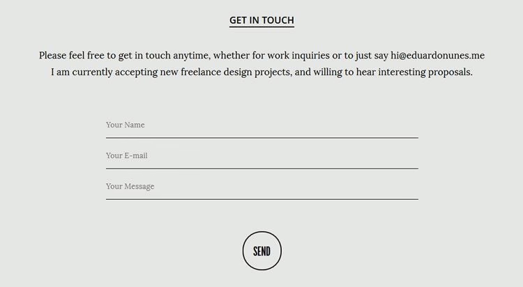
Tip 1. Minimalism:
Definition: Keep your contact form design clean and uncluttered.
Why:
- Reduces cognitive load: A minimalist design makes it easier for users to focus on the task at hand and avoid distractions.
- Improves user experience: A clean and uncluttered design creates a more pleasant and efficient user experience.
- Increases conversion rates: By focusing on essential information, you can reduce user friction and increase the likelihood of completing the desired action.
How to apply:
- Identify essential fields: Determine the minimum information required to achieve your goals.
- Remove unnecessary elements: Eliminate any fields or elements that are not essential for the user experience.
- Use clear and concise labeling: Use clear and concise labels for each field to avoid confusion.
- Consider using a single-column layout: A single-column layout can make the form easier to read and navigate.
Tip 2. Mobile-Friendly:
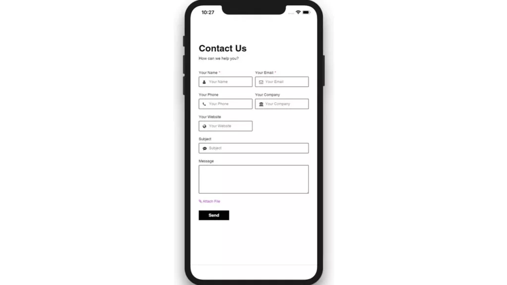
Definition: Ensure your contact form is optimized for mobile devices.
Why:
- Increased user accessibility: A mobile-friendly contact form allows users to easily access and complete the form on their smartphones or tablets.
- Improved user experience: A mobile-friendly design provides a better user experience, regardless of the device being used.
How to apply:
- Use responsive design: Design your contact form to adapt to different screen sizes and orientations.
- Optimize form elements: Ensure that buttons, input fields, and other elements are easy to tap and use on mobile devices.
- Test on multiple devices: Test your contact form on various devices and screen sizes to ensure it works as expected.
Tip 3: Effective Visual Hierarchy
Definition: Organize the elements of your contact form design in a way that guides the user’s attention.

Why:
- Improved usability: A well-organized form makes it easier for users to find and complete the required fields.
- Enhanced user experience: Visual hierarchy can create a more visually appealing and engaging form.
How to apply:
- Highlight the submit button: Make the submit button visually prominent to indicate the primary action.
- Emphasize required fields: Use asterisks or other visual cues to indicate which fields are required.
- Arrange elements logically: Group related fields together and place the most important fields at the top of the form.
- Use color, size, and placement effectively: Use color, size, and placement to draw the user’s attention to the most important elements of the form.
Tip 4: Helpful Error Messages
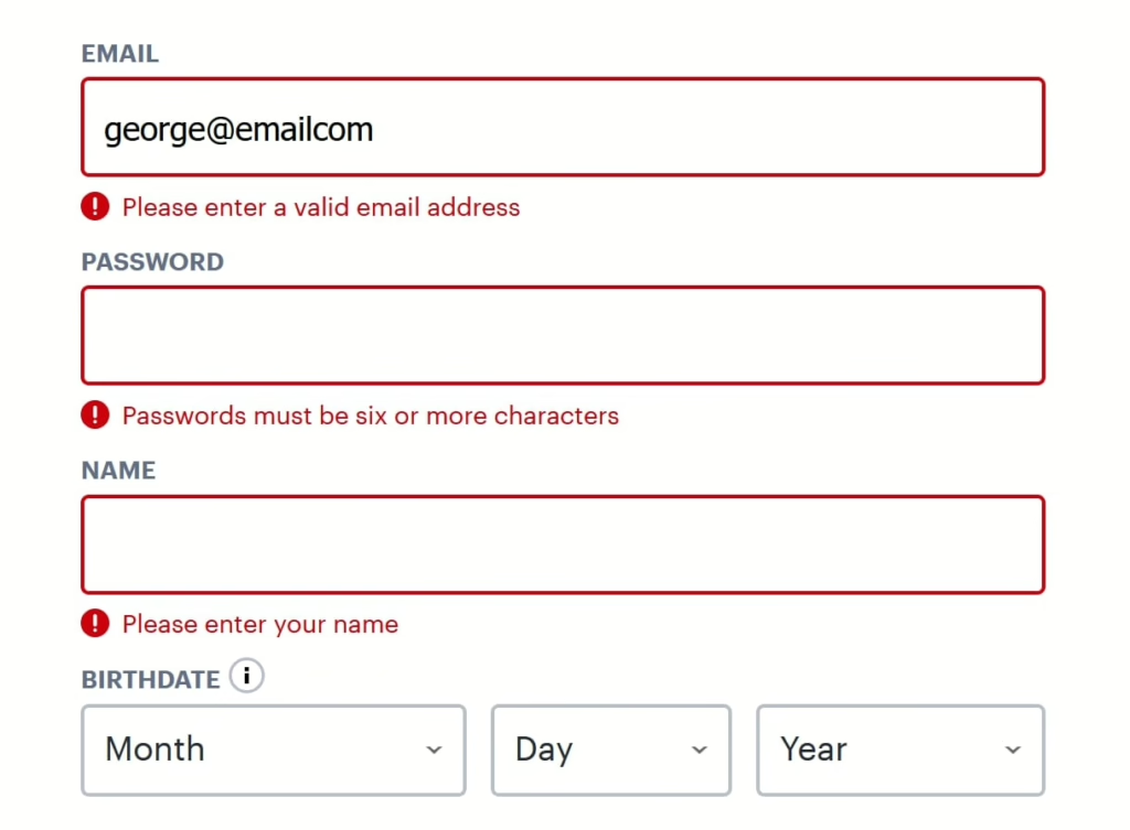
Definition: Provide clear and informative error messages to guide users when they make mistakes.
Why:
- Reduces frustration: Helpful error messages can prevent frustration and help users complete the form successfully.
- Improves user experience: Clear and concise error messages make it easier for users to understand and correct their mistakes.
How to apply:
- Display specific error messages: When a user makes an error, display a specific message that explains the problem.
- Use clear and concise language: Avoid using technical jargon or confusing language in your error messages.
- Provide guidance: Offer suggestions on how to correct the error, such as providing a link to relevant help documentation.
Tip 5: Auto-Response
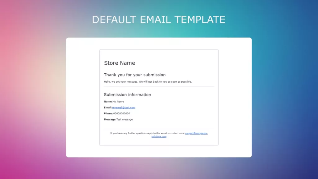
Definition: Send an automated email response to users immediately after they submit the contact form.
Why:
- Acknowledge receipt: Let users know that their message has been received and that you will respond shortly.
- Set expectations: Provide an estimated response time to manage expectations and reduce frustration.
How to apply:
- Create an automated email template: Compose a friendly and informative email that thanks users for contacting you and provides an estimated response time.
- Set up email automation: Configure your contact form to automatically send the email response upon submission.
Tip 6: Thorough Testing
Definition: Test your contact form thoroughly before deploying it to ensure it functions as expected.
Why:
- Identify and fix issues: Testing can help you identify and fix potential problems before they impact your users.
- Ensure a positive user experience: A well-tested contact form will provide a better user experience and reduce frustration.
How to apply:
- Test form functionality: Ensure that all fields are working correctly and that the form is submitted successfully.
- Test responsiveness: Check that the form works properly on different devices and screen sizes.
- Test for potential issues: Try to break the form by entering invalid data or performing unusual actions.
Tip 7: GDPR Compliance
Definition: Ensure that your contact form complies with the General Data Protection Regulation (GDPR) if your audience includes European users.
Why:
- Legal Compliance: Failure to comply with GDPR can result in hefty fines.
- Trust and Reputation: Adhering to GDPR demonstrates your commitment to protecting user privacy and can enhance your reputation.
How to apply:
- Include a Privacy Notice: Provide clear information about how you collect, use, and store user data.
- Obtain Consent: Obtain explicit consent from users before collecting their personal data.
- Provide Links: Include links to your privacy policy and other relevant legal documents.
Tip 8: Branding
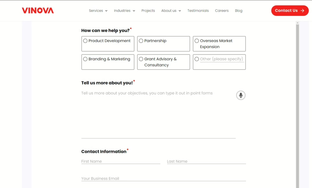
Definition: Ensure that your contact form is consistent with your overall brand identity.
Why:
- Reinforces trust and professionalism: A branded contact form helps to build trust with your audience and create a professional impression.
- Enhances user experience: A consistent brand experience can make your website more enjoyable and memorable for users.
How to apply:
- Use consistent branding elements: Ensure that the design of your contact form matches the branding of your website, including fonts, colors, and logos.
- Consider using your company logo: Include your company logo on the form to reinforce brand recognition.
Tip 9: Analytics
Definition: Use analytics to track user behavior and performance metrics.
Why:
- Identify areas for improvement: Analytics can help you identify areas where you can improve the user experience and conversion rates.
- Optimize your form: By understanding how users interact with your contact form, you can make data-driven decisions to optimize its design and functionality.
How to apply:
- Track submissions: Monitor the number of submissions and the average time it takes users to complete the form.
- Identify drop-off points: Determine where users are abandoning the form and investigate the reasons.
- Analyze conversion rates: Track the conversion rate of your contact form and identify areas for improvement.
- Use analytics tools: Utilize analytics tools to collect and analyze data on user behavior.
Tip 10: Don’t Ask for Phone Numbers (Unless Necessary)
Definition: Refrain from requesting phone numbers unless it is absolutely essential for your business operations.
Why:
- Respect user privacy: Some users may prefer not to share their personal contact information.
- Reduce friction: Asking for unnecessary information can increase the friction in the form-filling process and reduce conversion rates.
How to apply:
- Evaluate necessity: Determine if a phone number is truly necessary for your business purposes. If it’s not, consider removing it from the form.
- Provide alternative contact methods: If you need to collect contact information, offer alternative methods such as email or social media.

Frequently Asked Questions
How to design a contact form?
By following these 5 steps, you can create a professional and effective contact form that helps you connect with your audience.
1. Select a Template:
- Visit the Getsitecontrol template gallery and choose a form that aligns with your website’s design.
2. Adjust Text and Design:
- Customize the form’s text and appearance to match your brand and messaging.
- Ensure the design is clean, uncluttered, and mobile-friendly.
3. Set Up Submission Notifications:
- Configure the form to send you notifications when someone submits it.
- Customize the notification email to include relevant information.
4. Embed the Form into Your Website:
- Copy the embed code provided by Getsitecontrol and paste it into your website’s HTML.
5. Create a Follow-Up Email Automation (Optional):
- Set up an automated email response to thank users for contacting you and provide any additional information or next steps.
What is on a contact form?
A contact form is a web-based form that allows visitors to communicate with you directly through your website. It typically includes fields for users to input their name, email address, message, and other relevant details.
How should a contact form look?
By following these guidelines, you can create a contact form that is both user-friendly and effective. A contact form should be:
- Intuitive and Simple: The design should be clear and easy to understand, with input fields and help text clearly visible.
- Streamlined: Avoid overwhelming users with too many fields or unnecessary elements. Keep the form concise and focused.
- Visually Appealing: Use a clean and modern design that is consistent with your website’s overall aesthetic.
- Mobile-Friendly: Ensure the form is optimized for mobile devices to provide a seamless user experience.
- Submit Button: Make the submit button prominent and easily clickable.
What are the different types of contact forms?
There are generally four main types of contact forms:
- Standard Contact Form: This is the most common type of contact form, used for general inquiries and feedback. It typically includes fields for name, email, and message.
- Order Form: This type of form is used for collecting customer information and processing orders. It may include fields for shipping address, payment information, and product details.
- Registration Form: Used for collecting user information when creating an account or subscribing to a service. It may include fields for name, email, password, and other relevant details.
- Feedback Form: Designed to collect feedback from users about a product, service, or experience. It may include fields for rating, comments, and suggestions.