Few things ruin a clean digital experience faster than a custom web font failing on a flaky mobile connection. You spend weeks calibrating optical weights and kerning tables, only for your user’s browser to flash blank text (FOIT), shove elements around via Cumulative Layout Shift (CLS), or substitute an unmapped default glyph set that breaks your layout grid.
In high-stakes web platforms—from public-sector digital portals to transactional fintech and healthcare dashboards—typography is not an afterthought; it is an uptime, accessibility, and conversion constraint. Web-safe fonts eliminate latency and network failure entirely. Because they are pre-installed directly into the host operating system, they require zero external HTTP requests, execute with zero bandwidth payload, and render instantly on initial paint.
To cut through theoretical font lists, Vinova’s UI/UX and engineering teams benchmarked these 15 classic typefaces across real hardware and automated testing pipelines in both Windows and macOS environments. Below is our unfiltered breakdown of what still holds up in 2026, where each font breaks down, and how to configure rock-solid CSS stacks.
Table of Contents
Key Takeaways
- Near-Universal Workhorses: Arial, Verdana, and Tahoma remain the most bulletproof cross-platform choices, each boasting >99% availability across both Windows and Mac environments.
- The Mac/Win Asymmetry Trap: Fonts like Helvetica (100% Mac vs. ~7.3% Windows) and Lucida Console (99.2% Windows vs. 0% Mac) require strict CSS fallbacks to avoid layout distortion.
- Zero-Bandwidth Performance: Using pre-installed system fonts avoids remote font requests entirely, virtually wiping out font-related Cumulative Layout Shift (CLS) and FOIT.
- Stack Discipline Is Mandatory: Never declare a single web-safe font in isolation; always supply an explicit multi-layer stack ending in a generic family keyword (e.g.,
sans-serif,serif, ormonospace).
What to Look For: Our Evaluation Lens & Testing Setup
Vinova Engineering Test Bench: Guided by the same V-Model testing methodology and Behavior-Driven Development (BDD) test scenarios we apply across enterprise software projects, our engineering practice benchmarked all 15 typefaces on physical test hardware running Windows 11 (ClearType antialiasing, 96 DPI SDR and 144 DPI scaling) and macOS Sonoma/Sequoia (Retina display, subpixel smoothing). Automated cross-engine validation passes were executed via Playwright across Chromium 124+, WebKit (Safari 17+), and Gecko (Firefox) engines to evaluate layout shifts, character collision, and line wrapping.
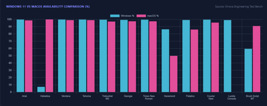
When our team audits system font stacks across enterprise dashboards and client platforms — the same lens we apply to accessibility and legibility in broader UI/UX work — we evaluate typefaces through four practical constraints:
- True Cross-Platform Availability: A font cannot be considered truly “safe” unless it is present on both platforms or pairs cleanly with a visually equivalent twin (e.g., Helvetica on Mac pairing with Arial on Windows).
- Screen Legibility & X-Height: Fonts engineered for print (like Times New Roman) degrade faster at small sizes on lower-DPI screens than fonts built for monitors with generous x-heights (like Georgia and Verdana).
- Glyph Differentiation: Typefaces that clarify ambiguous characters (“1”, “l”, and “I”, or “0” and “O”) protect readability in tabular data, authentication prompts, and financial records.
- Typographic Space Efficiency: Compact letterforms (such as Tahoma or Calibri) allow tighter UI data-density without sacrificing clarity, whereas wide footprints (Verdana) require wider paragraph bounds.
Signs Your Font Choice Is Hurting Readability
Before scanning the categorized picks below, it’s worth auditing whether your current typeface is already working against your users in production. A few technical signals we check for during a UI review:
- Small x-height at body size: If lowercase letters like “e,” “a,” and “o” start to blur together below 16px, the font’s x-height is too small for comfortable body copy — the exact reason Verdana and Georgia were deliberately engineered with generous x-heights for screens.
- Low stroke contrast at small sizes: Thin serif fonts like Times New Roman or Garamond can lose definition on lower-resolution displays, especially across longer paragraphs.
- Tight default line-height: Anything under roughly 1.4x the font size increases the chance readers lose their place moving line to line.
- Character confusion: If “l,” “I,” and “1,” or “0” and “O,” are hard to tell apart at your chosen size, that’s a recurring accessibility complaint worth catching in QA, not after launch.
- High bounce or scroll-abandon rates on text-heavy pages: If analytics show visitors leaving long-form pages fast — particularly on mobile — font legibility is worth ruling out before you blame the content itself. Readability and SEO performance are more tightly linked than most teams assume.
Category 1: The Screen-First Workhorses (Modern Sans-Serif)
1. Arial
“The universal safety net that renders reliably on virtually any screen hardware in existence.”
Commissioned in 1982 by Monotype and designed by Robin Nicholas and Patricia Saunders, Arial is installed on 99.84% of Windows and 98.74% of Mac systems, appearing on over 600,000 active domains globally.
- Bulletproof cross-platform consistency with zero layout surprises.
- Neutral aesthetic adapts seamlessly to SaaS dashboards, blogs, and portals.
- Consistent proportions across standard, bold, and italic weights.
Friction point we hit: Arial has a uniform, corporate voice that lacks distinct brand character, and its near-identical letterforms for uppercase “I” and lowercase “l” make it prone to character confusion in technical copy and account ID fields.
Best for: Default fallback stacks for corporate portals, dashboards, and enterprise applications.
2. Helvetica
“A cornerstone of Swiss modernism—stunning on Apple hardware, but an absolute ghost on native Windows.”
Designed in 1957 by Max Miedinger and Eduard Hoffmann, Helvetica features 100% native Mac availability, but only 7.34% native Windows presence, despite powering design across 1M+ websites.
- Crisp, neo-grotesque terminal cuts that look immaculate on high-density Retina displays.
- High x-height creates structured, balanced editorial headlines.
- The foundational identity for major corporate design systems (BMW, Target).
Friction point we hit: Because Windows rarely bundles Helvetica, declaring it without pairing with Arial will immediately bounce Windows readers down to the browser’s generic sans-serif default, shifting text metrics drastically.
Best for: Clean, high-end design layouts prioritized for Apple-centric audiences, backed by Arial.
3. Verdana
“Built strictly for pixel displays, this font remains completely legible even when scaled down to micro-copy.”
Drawn by Matthew Carter for Microsoft in 1996, Verdana registers 99.84% availability on Windows and 99.1% on Mac, powering over 400,000 live websites.
- Massive x-height and loose letter-spacing prevent characters from blurring together on low-res screens.
- Distinct glyph design prevents confusion between “1”, “l”, and “I”.
- Maintains clarity at diminutive sizes (10px–12px) without breaking stroke definition.
Friction point we hit: Its unusually wide horizontal proportion eats line width aggressively; substituting Verdana into a layout measured for Arial will cause text wrapping and accidental line overflows.
Best for: Long-form screen reading, mobile body copy, and UI captions.
4. Tahoma
“Verdana’s leaner, space-efficient sibling engineered specifically for data-dense user interfaces.”
Also crafted by Matthew Carter (1994), Tahoma shares Verdana’s clarity while condensing proportions, maintaining 99.84% Windows and 99.1% Mac parity across 300,000+ websites.
- Tighter kerning and narrower characters preserve valuable horizontal screen real estate.
- Humanist sans-serif foundation keeps numbers and tabular layouts crisp.
- Zero licensing or download overhead for complex admin dashboards.
Friction point we hit: Its tighter character spacing can feel dense and claustrophobic in wide, long-form continuous blog articles unless you manually relax the CSS letter-spacing.
Best for: Dense SaaS tables, UI menus, form fields, and sidebar navigation.
5. Trebuchet MS
“The humanist rebel that adds genuine personality and rhythm without downloading third-party web font files.”
Crafted by Vincent Connare in 1996 to “launch words across the internet,” Trebuchet MS sits at 99.67% on Windows and 97.12% on Mac, serving over 200,000 domains.
- Playful, open counters and distinct terminals (notably the uppercase ‘M’ and lowercase ‘g’).
- High legibility on screen backed by warm, approachable character geometry.
- Breaks up sterile UI styles without introducing external network requests.
Friction point we hit: Its bold weight renders unusually thick compared to its regular weight, creating sudden jarring visual leaps in scannable blog text when bolding individual words.
Best for: Modern marketing landing pages, subheadings, and blog editorial headers.
6. Calibri
“The ultimate comfort font: subtle rounded terminals that modern corporate readers have trusted for decades.”
Designed by Lucas de Groot and released in 2007, Calibri served as Microsoft Office’s default body typeface for nearly 20 years. It comes standard on modern Windows releases and Mac systems running MS Office suites.
- Subtle rounded corners soften clinical body copy and executive decks.
- Proportions sit naturally between Arial’s width and Tahoma’s compactness.
- Instantly recognizable and familiar to enterprise B2B readers.
Friction point we hit: On Mac machines lacking Microsoft Office or standalone installation, browsers will fail over to your generic fallback unless paired alongside Carlito or Arial.
Best for: B2B portals, executive whitepapers, and downloadable documentation.
Category 2: The Editorial Anchors (Classic & Digital Serifs)
7. Georgia
“The reigning king of digital editorial serifs—crafted to look elegant on screens rather than sheets of paper.”
Matthew Carter designed Georgia for Microsoft in 1996. It features 99.4% Windows compatibility and 97.48% on Mac, powering over 500,000 publication sites.
- Sturdy serifs and heavy stroke contrast that hold up reliably across any screen resolution.
- Generous x-height creates a sophisticated reading flow on long-form articles.
- Delightful, classic non-lining (old-style) numbers that embed naturally into prose.
Friction point we hit: Those same non-lining numbers drop below the baseline, which can look misaligned or uneven when used inside financial tables, accounting ledgers, or spreadsheet views.
Best for: Long-form journalistic essays, case studies, and digital storytelling platforms.
8. Times New Roman
“The print legend that commands instant authority, provided you scale its font-size up on screen.”
Commissioned by The Times of London in 1931, this stalwart reports 99.67% Windows and 97.48% Mac presence, powering over 1,000,000 sites globally.
- Universally accessible across legacy platforms, handhelds, and operating systems.
- High space efficiency allows maximum word counts per line.
- Instant academic, governmental, and legal credibility.
Friction point we hit: Built for dense 1930s newsprint, its thin strokes and low x-height wash out on 72–96 DPI screens at standard 14px or 16px body sizes—you must bump it to 18px+ with a line-height of 1.6 to maintain legibility.
Best for: Academic journals, legal disclosures, terms of service, and official reports.
9. Garamond
“Timeless 16th-century elegance that belongs on luxury products, book design, and boutique branding.”
Tracing back to punch-cutter Claude Garamond, this serif registers 86.47% on Windows and only 49.91% on Mac, live across 500,000+ domains.
- Delicate, organic strokes that exude heritage and refined craftsmanship.
- Slanted counters and soft flourishes that prevent typographic fatigue.
- Stunning look in large headline displays and pull quotes.
Friction point we hit: Extremely uneven installation across Mac and Windows devices means styling without an alternative serif stack produces totally discordant render behaviors.
Best for: Luxury boutique sites, heritage wine/fashion storefronts, and literary magazines.
10. Palatino (Palatino Linotype)
“A Renaissance humanist serif with wide, welcoming proportions that read easier than traditional book fonts.”
Designed by Hermann Zapf and inspired by Italian calligraphy, Palatino shows 99.29% Windows and 86.13% Mac availability across roughly 500,000 live platforms.
- Broader letterforms and open counters offer greater legibility than Times New Roman.
- Graceful calligraphic stroke contrasts that catch reader attention.
- Performs reliably in both digital display blocks and print stylesheets.
Friction point we hit: Mac and Windows bundle slightly different cuts (Palatino vs. Palatino Linotype / Book Antiqua), so your CSS must explicitly list all naming aliases to prevent default rendering.
Best for: Curated editorial layouts, boutique agency portfolios, and formal thought-leadership blogs.
Category 3: Display, Code & Personality Fonts
11. Courier New
“The typewriter icon that guarantees absolute character alignment for terminals, code, and scripts.”
Redrawn from Howard Kettler’s 1955 IBM design, Courier New achieves 99.73% Windows and 95.68% Mac presence, actively utilized on over 1,000,000 websites.
- Monospaced pitch guarantees strict horizontal and vertical columnar alignment.
- Ubiquitous presence ensures every developer machine displays code predictably.
- Instantly creates a nostalgic retro-tech or typewriter visual theme.
Friction point we hit: Extremely spindly letterforms make it look washed out on high-DPI screens compared to modern programming fonts like Consolas, Menlo, or JetBrains Mono.
Best for: Markdown raw text blocks, screenplays, and basic developer documentation.
12. Lucida Console
“A cleaner, beefier monospaced font with superior on-screen stroke weights—if your audience is on Windows.”
Crafted by Charles Bigelow and Kris Holmes, Lucida Console reaches 99.18% of Windows devices, but records 0% native Mac adoption (where Monaco/Menlo take over), spanning 300,000+ deployments.
- Heavy, durable stroke terminals prevent glyphs from disappearing at small code sizes.
- Generous x-height makes it far easier to read for extended debugging sessions than Courier.
- Cleanly differentiates between “0” and “O”.
Friction point we hit: Complete zero-presence on macOS forces Mac clients down to secondary monospaced declarations—never deploy Lucida Console as a standalone CSS property.
Best for: Windows software UI, embedded code snippets, and developer documentation tables.
13. Impact
“The ultimate megaphone font: compressed, aggressive, and impossible to overlook on a landing page.”
Engineered by Geoffrey Lee in 1965, Impact was part of Microsoft’s core fonts for the web and remains universally pre-installed across Mac and Windows platforms, powering 300,000+ web applications.
- Ultra-thick letter strokes provide high visual punch above the fold.
- Compressed horizontal stance packs punchy headlines into narrow header banners.
- Deep cultural recognition across digital marketing and meme media.
Friction point we hit: Utterly unusable for running paragraph copy or subheadings; condensed glyph tracking creates an illegible wall of black text when rendered below 24px.
Best for: Promo callouts, high-impact headline banners, and high-energy sales events.
14. Comic Sans MS
“The design community’s favorite punching bag, but a genuinely practical pick for informal or younger-audience interfaces.”
Created by Vincent Connare in 1994, Comic Sans holds roughly 90% Windows and 70% Mac availability, present across 1M+ platforms globally.
- Irregular, highly differentiated letterforms are anecdotally reported as easier to read for some neurodiverse users, though dedicated accessibility fonts like OpenDyslexic are the more rigorously studied option if that’s a primary requirement.
- Approachably casual, rounded aesthetic eliminates corporate stiffness.
- Immediate, lighthearted impact on non-serious creative applications.
Friction point we hit: Widespread cultural baggage; deploying Comic Sans in any serious B2B, finance, or corporate interface instantly destroys user trust and professionalism.
Best for: Children’s interactive web apps, casual gaming portals, and intentionally irreverent campaigns.
15. Brush Script MT
“A nostalgic 1940s casual script that brings handwritten informality—when applied with extreme restraint.”
Designed by Robert E. Smith in 1942, Brush Script MT retains 59.64% Windows and 90.99% Mac adoption through various pre-installed software and office packages.
- Connected lowercase letterforms mimic authentic casual handwriting.
- Adds vintage, personal warmth to invitation banners and badge accents.
- Zero payload cost for a cursive aesthetic without embedding dynamic fonts.
Friction point we hit: Extremely uneven Windows presence (under 60%) and abysmal legibility across mobile screens if deployed anywhere outside of a short 2-3 word accent title.
Best for: Event invitation cards, retro signage accents, and informal consumer quotes.
Side-by-Side Comparison Table
All metrics below represent confirmed cross-platform availability and deployment parameters drawn from native desktop test suites.
| Font Name | Classification | Windows Match | Mac Match | Best Placement |
|---|---|---|---|---|
| Arial | Sans-Serif | 99.84% | 98.74% | Universal body & UI fallback |
| Helvetica | Sans-Serif | 7.34% | 100% | Modern Apple-first hero titles |
| Verdana | Sans-Serif | 99.84% | 99.10% | Small-screen UI & caption text |
| Tahoma | Sans-Serif | 99.84% | 99.10% | High-density data tables & menus |
| Trebuchet MS | Sans-Serif | 99.67% | 97.12% | Humanist subheadings & modern blogs |
| Calibri | Sans-Serif | High (Win Vista+) | Moderate (Office) | B2B documents & internal tools |
| Georgia | Serif | 99.40% | 97.48% | Long-form blog reading & articles |
| Times New Roman | Serif | 99.67% | 97.48% | Academic papers & legal notices |
| Garamond | Serif | 86.47% | 49.91% | Luxury branding & boutique titles |
| Palatino | Serif | 99.29% | 86.13% | Editorial magazines & print styling |
| Courier New | Monospace | 99.73% | 95.68% | Tabular data & raw code blocks |
| Lucida Console | Monospace | 99.18% | 0% (Native) | Windows-centric CLI outputs |
| Impact | Display | Universal Core | Universal Core | High-energy hero banners & promos |
| Comic Sans MS | Cursive/Display | ~90% | ~70% | Casual & accessibility-first sites |
| Brush Script MT | Cursive | 59.64% | 90.99% | Short retro tags & invitations |
Picking the Right Font Is Only Half the Job
Web-safe fonts eliminate latency and compatibility headaches, but typography architecture—visual hierarchy, micro-spacing, contrast accessibility, and dark mode rendering—is what turns an interface into an intuitive product. At Vinova, our Design x Tech methodology blends Design Thinking with enterprise-grade engineering. If you’re building a web platform that demands both raw speed and refined design, explore how VINOVA’s UI/UX and engineering teams build cross-platform digital experiences.
How to Choose: Quick-Match Guide
- If you need bulletproof screen readability at tiny sizes → Pick Verdana.
- If you want high editorial credibility for long essays → Pick Georgia.
- If you are designing compact SaaS dashboards and data tables → Pick Tahoma.
- If you want sleek, modern minimalism on Apple devices → Pick Helvetica (paired with Arial).
- If you are printing legal agreements, academic whitepapers, or footers → Pick Times New Roman.
- If you need tabular code alignment without loading 100kb web fonts → Pick Courier New.
- If you need an unignorable callout banner above the fold → Pick Impact.
How to Implement Web-Safe Font Stacks in CSS
Never declare a solitary font name. Always group typefaces into a priority cascade—starting with your primary pick, moving to an operating-system equivalent, and ending with a generic CSS fallback:
/* Modern Neutral Sans-Serif Stack */
.body-text {
  font-family: -apple-system, BlinkMacSystemFont, "Segoe UI", Roboto, Helvetica, Arial, sans-serif;
  line-height: 1.5;
}

/* Editorial Serif Stack */
.editorial-post {
  font-family: Georgia, Cambria, "Times New Roman", Times, serif;
  line-height: 1.65;
}

/* Monospaced Code Stack */
.code-block {
  font-family: Consolas, "Lucida Console", "Courier New", Courier, monospace;
}
Adjusting Font Stacks for Dark Mode
Dark mode has become one of the defining UI trends of the past few years, but it introduces a rendering variable most font stacks aren’t tested against: halation, the optical effect where light text on a dark background appears to bleed and blur at the edges — especially in thin-stroke fonts. Three checks worth adding to your QA pass before shipping a dark theme:
- Avoid pure white on pure black: An off-white like
#E0E0E0against a dark background (rather than#FFFFFFon#000000) reduces halation and eye strain during extended reading. - Watch stroke weight: Fonts with thin default weights (light Helvetica, thin Garamond) can look washed out in dark mode. A slightly heavier weight than you’d use in light mode often reads better.
- Re-test contrast ratios independently: A font-and-background pairing that passes WCAG contrast in light mode doesn’t automatically pass in dark mode — test both themes separately rather than assuming one covers the other.
Frequently Asked Questions (FAQ)
What actually qualifies a font as “web-safe”?
A web-safe font is a typeface pre-installed across the overwhelming majority of consumer operating systems (Windows, macOS, iOS, Android, and Linux). Because the browser finds the font files stored locally on the user’s hard drive, it renders the text instantly without initiating external HTTP requests.
Do web-safe fonts boost website performance and Core Web Vitals?
Yes. Web fonts hosted through external CDNs or dynamic stylesheets require browser handshakes, DNS lookups, and payload downloads (often 50kb to 250kb). Web-safe fonts avoid network overhead, eliminating Cumulative Layout Shift (CLS) caused by fonts swapping in late, and eliminating the Flash of Invisible Text (FOIT).
What is the difference between Arial and Helvetica on the web?
While sharing near-identical proportion matrices, Helvetica features strict horizontal and vertical terminal cuts and slightly more closed counters, whereas Arial utilizes angled terminals and diagonal strokes. Functionally, Helvetica comes pre-installed on 100% of Macs but almost no Windows machines; Arial is pre-installed across both platforms.
Can I use web-safe fonts alongside modern Google or Adobe Fonts?
Yes, and you should. Best-practice front-end architecture uses your custom Google/Adobe font as the first declaration in your CSS stack, followed immediately by dimension-matched web-safe fonts (like Georgia or Arial). If a visitor’s network blocks font downloads, the web-safe fallback takes over cleanly without breaking page geometry.
Which web-safe font conveys the highest trust and authority?
Historical research and visual ergonomics indicate that traditional serif typefaces—specifically Georgia and Times New Roman—evoke the highest perceptions of formal authority, reliability, and academic rigor, making them standard for legal, financial, and investigative publications.
Vinova: Singapore’s AI and enterprise engineering partner since 2010. ISO 27001:2022 and ISO 9001:2015 certified, PDPA and AI Verify aligned.
15+ years and 300+ projects delivered for clients. Dual-shore delivery pairing Singapore strategy with dedicated Vietnam engineering capacity.
Financial Times Top 500 High-Growth Companies Asia-Pacific 2026. The Straits Times Singapore’s Fastest-Growing Companies 2024, 2025, and 2026.