What’s the number one reason people delete a mobile app?
It’s not a lack of features. A 2025 study of US users found that a confusing or cluttered design is a top reason for hitting ‘uninstall’.
In today’s market, great design isn’t just about looking good; it’s about being smart, simple, and easy to use.
This guide breaks down the top mobile app design trends for 2025. We’ll cover everything from 3D interfaces and smart animations to the final checks you need to complete before you launch.
Table of Contents
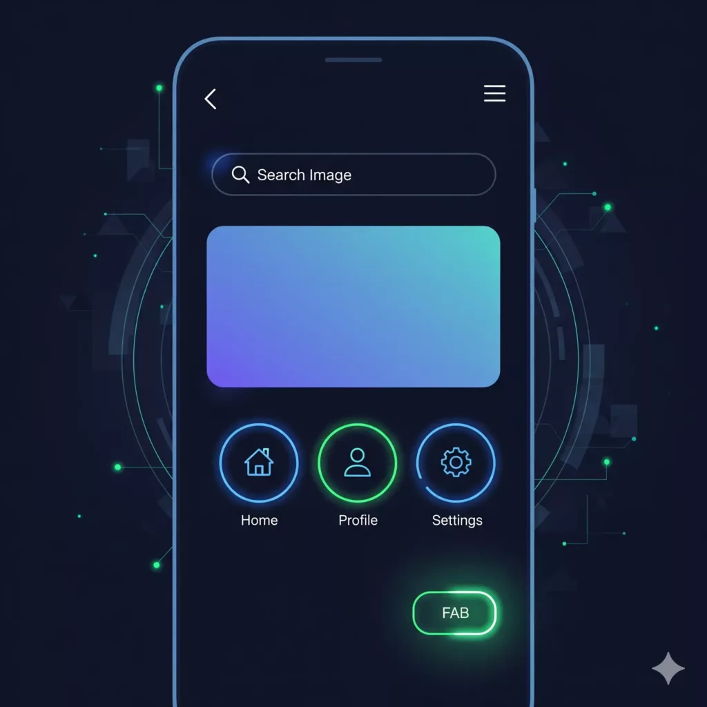
The New Face of Minimalism: UI Trends for 2025
The look and feel of mobile apps in September 2025 is all about a smarter, more expressive kind of minimalism. Clean and simple is still the goal, but designers are now adding back subtle layers of depth, motion, and intelligence to make apps more intuitive and engaging. Here are the four key trends defining the new face of minimalism.
1. Beyond Flat: The Return of Depth and Dimension
For years, “flat design” was king. Now, designers are adding back subtle shadows, layers, and rounded corners to make app elements feel more tangible and real, a style known as “Dimensional Minimalism.”
This isn’t just for looks; it serves a crucial function. When a button looks slightly “raised” or a search bar seems “carved out” from the background, you intuitively understand what it does without having to think about it. This makes the app feel more predictable and easier to use.
2. Motion with a Purpose
Flashy animations are out. In their place are small, purposeful “microinteractions” that guide you and give you feedback. Think of the way the iOS Dynamic Island wiggles to confirm you’ve toggled Silent Mode. This kind of motion is a quick, clear signal that the app understood your action.
This trend also includes more than just visuals. Haptic feedback (vibrations) and simple sounds are now being used to confirm actions, like a successful payment or a pull-to-refresh. A polished app now engages more than just your eyes, making the experience more satisfying.
3. Big, Bold Type and Strategic Color Pops
With less clutter on the screen, typography has become a primary design element. Expect to see apps using big, bold, and expressive fonts to create both structure and mood. The words themselves are now a key part of the visual design.
To complement this, designers are pairing muted backgrounds with bright, unexpected accent colors. This pop of color isn’t random; it’s used strategically to guide your eye to the most important buttons and actions on the screen, acting as a functional signpost.
4. AI That’s Genuinely Helpful (and Transparent)
AI in app design is finally moving past the hype. The best integrations in 2025 are the ones that are genuinely helpful, providing smart recommendations or automated summaries that feel like a natural part of the app.
The new design challenge is making sure this doesn’t feel creepy or unpredictable. The solution? Using subtle visual cues, like the shifting colors of the Apple Siri Gradient, to let you know when the AI is working. This transparency builds trust and ensures you always feel in control of your experience.
Foundational Principles for a Polished UI
While new design trends are exciting, a truly great app in 2025 must be built on a few timeless, foundational principles. Getting these basics right is what separates a frustrating app from a polished, user-friendly experience. Let’s look at the core rules that never go out of style.
The Three Pillars of Great Design: Clarity, Consistency, and Hierarchy
Before you add any fancy features, you have to nail these three pillars of usability. They’re the bedrock of any successful user interface.
First, the design must be clear. Users should be able to open your app and instantly understand what to do and where to go. This means using simple language, familiar icons, and breaking down complex tasks into small, easy steps.
Next, it has to be consistent. All your buttons, colors, and fonts should look and feel the same on every single screen. This builds trust and means users don’t have to relearn how your app works every time they navigate to a new section.
Finally, you need a strong visual hierarchy. This is the art of guiding the user’s eye to the most important elements first. You can do this with size, color, and placement. One of the most powerful tools for this is simply whitespace—giving elements room to breathe makes your content much easier to scan and understand.
Don’t Forget Accessibility: It’s Non-Negotiable
In 2025, designing for accessibility is no longer optional; it’s a fundamental part of a smart business strategy. A good minimalist design is naturally more accessible because it’s already simple and clear.
Here are a few key rules to follow:
- High Color Contrast: Make sure your text is easy to read against its background (a contrast ratio of at least 4.5:1 is the standard).
- Legible Fonts: Use clear, simple fonts with plenty of space between the lines.
- Large Touch Targets: Ensure all buttons and links are at least 48×48 pixels wide and tall. This simple rule makes them easy to tap accurately for everyone, reducing frustration and accidental clicks.
The best part? Focusing on accessibility doesn’t just help users with disabilities; research shows it improves the experience for all your users, leading to higher satisfaction and engagement.
The Finalization and Validation Framework
Finishing your app’s design isn’t just a final creative flourish; it’s a careful, three-step process to make sure it’s ready for the real world. Following this validation framework for 2025 ensures your design is beautiful, functional, and ready for a successful launch.
Step 1: The Internal Review and Checklist
Before you show your design to the world, you need to review it with your own team—designers, developers, and other stakeholders. The best way to do this is with a detailed checklist. This turns vague ideas into a simple “yes” or “no” check and ensures nothing gets missed.
Your checklist should cover the basics:
- Consistency: Are all the colors, fonts, and buttons the same on every screen?
- Navigation: Is it obvious how to get around the app? Are the button labels clear?
- Accessibility: Are the buttons big enough to tap easily? Is the text easy to read?
- Content: Did you remember to replace all the “lorem ipsum” placeholder text with the final copy?
Step 2: Test It With Real People
After your internal review, it’s time to see how your design holds up with real users. This is where you find out if your great ideas actually work.
- Usability Testing: This is where you watch real users interact with your app. It’s the single best way to find out where they get stuck, confused, or frustrated.
- A/B Testing: This is a more data-driven approach. You show two slightly different versions of a design to different groups of users and measure which one gets more clicks or sign-ups. This lets you make decisions based on real data, not just guesses.
This step isn’t the end. It’s the beginning of a continuous feedback loop that will help you keep improving your app even after it launches.
Step 3: Getting Past the App Store Gatekeepers
The last step before your app goes live is getting it approved by platforms like the Apple App Store. This isn’t just a technical check; it involves a human review, and the quality of your UI is a major factor.
A “substandard user interface” is one of the top reasons apps get rejected. This can mean anything from broken links and placeholder content to a design that’s just plain confusing. The best way to ensure a smooth approval is to follow the official design guidelines (like Apple’s Human Interface Design Guidelines) from the very beginning of your project. A polished, professional UI is much more likely to pass the review without any delays.
Case Studies and Actionable Insights
The best way to understand great design is to see it in action. Let’s look at how some of the top apps in 2025 are using minimalist UI principles, and then we’ll break down the key takeaways your team can start using today.
Learning from the Best: How Top Apps Nail Minimalist Design
By looking at industry leaders, we can see how core design principles are being put into practice to create smooth, intuitive experiences.
- Making Onboarding Seamless: A great first impression is key. The Notion app avoids overwhelming new users by asking a few simple questions to instantly create a personalized workspace. It’s a smart way to get people started without the “blank page” anxiety.
- Keeping Navigation Invisible: The best navigation is the kind you don’t even notice. Pinterest uses infinite scrolling and a navigation bar that fades into the background, keeping your focus entirely on discovering new content.
- Using Motion to Set the Mood: Motion isn’t just for feedback; it can create an emotional connection. The Calm app uses gentle animations and soothing sounds to create a relaxing experience, while apps like Telegram and Apple Wallet use crisp, fast animations to signal speed and build trust through flawless performance.
Actionable Takeaways for Your Team in 2025
The goal of modern minimalism isn’t just to remove things, but to refine what’s left to be as effective as possible. Here are the key lessons to guide your design process.
- Embrace the ‘New’ Minimalism. Don’t be afraid of subtle depth and soft, rounded shapes. The pure “flat” look is evolving into something more tactile and intuitive that’s both modern and engaging.
- Make Every Motion Count. Every animation, vibration, and sound should have a clear purpose, whether it’s to guide the user, confirm an action, or provide a bit of delight.
- Create a Feedback Loop. “Final” is never final. Use usability testing and A/B testing continuously to gather real-world data and keep improving your design based on how people actually use it.
- Design for Everyone from Day One. Accessibility isn’t an extra feature; it’s a core business strategy. Building an app that everyone can use leads to higher satisfaction and a better, more successful product for all.
Minimalist design isn’t just for mobile apps; it’s a powerful tool for creating clean, effective websites. To show you what great minimalism looks like in 2025, here are five of the best examples and what makes them work so well.
Top 5 Examples of Minimalist Website Design in 2025
1. Apple: The Gallery Experience
Apple’s website is a masterclass in minimalism that mirrors its brand. It uses huge, high-quality product photos and tons of whitespace to create a clean, gallery-like feel. The navigation is simple, and subtle animations and auto-playing videos draw you in without being distracting. It’s a design that’s as sophisticated as the products it sells.
2. Dropbox: Functional and Friendly
Dropbox’s website is all about making a complex service feel simple and trustworthy. It uses clean, abstract illustrations to explain cloud storage and a simple blue-and-white color scheme to feel reliable. Bold, yellow calls-to-action are placed strategically to guide you exactly where you need to go.
3. Squarespace: Elegant and Inspiring
Squarespace uses its own website to show off what its design tools can do. The layout is elegant and visually rich without feeling cluttered. It uses large margins around text blocks to make everything easy to read and mixes different font styles to feel both creative and professional. It’s a perfect showcase for a design-focused product.
4. Jeton.com: Sophisticated and Seamless
Jeton.com is recognized as a leading design for 2025 because it focuses on creating a seamless payment experience. Its sophisticated and intuitive interface is designed to be as efficient and user-friendly as possible, showing how great design can elevate a financial platform and empower its users.
5. The Botanist: Simple and Immersive
This restaurant website is a great example of using simplicity to create a mood. It uses a bold, simple typeface and lots of whitespace to let the content “breathe.” The best part is the navigation menu, which is clean and disappears as you scroll, creating an immersive journey that feels like you’re exploring nature.
Conclusion and Recommendations
A simple design is a smart design. The best mobile apps of 2025 will use smart features, motion, and AI to create a clean user experience.
To build a successful app, follow these steps:
- Get a final design review from your whole team before you build.
- Use data from user testing to make design decisions.
- Keep testing and improving your app after it launches.
This process helps you build an app that is easy to use and ready for long-term success. Is your design process built to create a better user experience? Review your final checks to build a smarter app.